
Analyze
This workbook contains various analyses on different tables. In addition to maps on German postal codes, this workbook also contains evaluations on Austrian and Swiss postal codes. So that you can assign the tables to the correct countries, the sheets and tables are provided with a two-character country abbreviation.
The workbook contains the following sheets:
- Distribution of sales DE
- Trade and transport DE
- Purchasing Power Europe
- Population pyramids AT
- Boston Grid CH
- Radio station AT
Distribution of sales DE
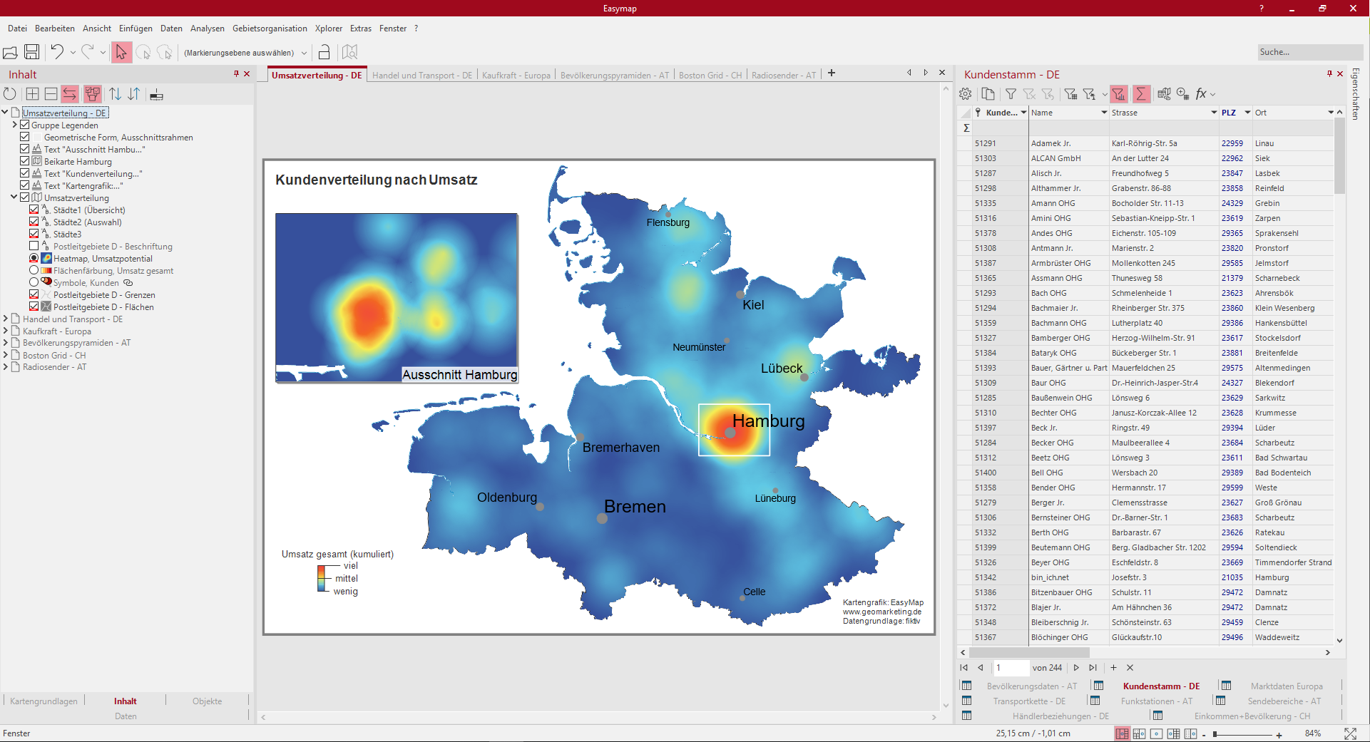
This sheet shows you a Heatmap, sales potential with the sales trend in postal zone 2 of Germany. There is also a inset map with the section Hamburg. The Color legend shows you the color gradient of the heatmap, i.e. where is there a high sales concentration and where not.
Via the control window content you can also display the sales distribution as surface coloring, total sales or as symbols, customers. All three analyses are based on the same data column of the table "Customer base DE" and can be selected by clicking on the radio button, as these are in the same visibility group. The map view is reduced to the essential by deleting the topographic levels such as motorways, federal roads, rivers and bodies of water.
So you can recreate this map:
- Selection of the analysis Heatmap with the subtype site-related, settings: Data column "Total sales", radius 25 km, linearly decreasing, continuous color gradient slightly modified from the default.
- Selection of analysis Area coloring, settings: Data column "Total sales" and 5 classes with a user-defined classification in round thousands of steps.
- Selection of the analysis symbols for the locations, settings: Total sales" column, select symbols, define size and color.
- Place all three analyses in a Similar visibility group, so that only one of the three can be made visible in the control window Content.
- Color Legend for all three analyses.
- Inset Map onto the sheet and select the map Turnover distribution, by Zoom within marked map set the section to Hamburg.
- Geomatric shape under free hand graphics and drag the border around Hamburg onto the map, set the border color to white and the filling to no color.
- Text box for headings and footnotes.
The following tables were used:
- Customer base - DE
Trade and transport DE
![]()
This sheet shows you dealer relationships and transport chains represented by relationship analysis and symbol analysis. Postcode areas of postal zone 2 are used as base maps. In the control window Content, you can switch between a transportation chain with logistics centers and a dealer relationship with dealer locations by selecting one of the relationship analyses. The relationship analyses and symbol analyses are grouped both Visible to both sides and Visible to both sides and show you the interaction of the different visibility groups. To better estimate the distances of the locations, a scale is inserted on the sheet.
In order to focus on relationship analyses, this map does not include topographical levels. The Internet map in grey tones serves for better orientation in the room.
So you can recreate this map:
- Dealer relationships: Selection of the analysis Relations with the column "Distance (in km)" for a uniform dashing; color according to characteristic of the column "Dealer" and line width in five classes according to user-defined classification of the column "Distance (in km)".
- Dealer locations: Selection of the analysis Symbols with the data column "Dealer" and a classification according to characteristic; adapt colour, shape and size.
-
Transport chains: Selection of analysis Relations with column "TEU", four classes with a user-defined classification.
- Logistics centers: Selection of the analysis Symbols with the data column "Location" and a classification according to characteristic.
- A combined legend was inserted for the dealer locations as well as for the relations of the transport chain.
- The analyses of the traders (symbols and relationships) were packed into a Simultaneous visibility group. A further simultaneous visibility group was formed for the logistics centres and the transport chain, then to form a mutual visibility group with the other simultaneous visibility group.
- Drag a Internet map onto the map and select the BKG WebAtlasDE.light in grayscale.
- Insert a Scale from the control window Objects onto the sheet and in the settings select the Number of Sectors to 5 with a Total Width 50 km and a Sector Width of 10.
- Insert Text for header and footer.
The following tables were used:
- Transport chain - DE
- Dealer relationships - DE
Purchasing Power Europe
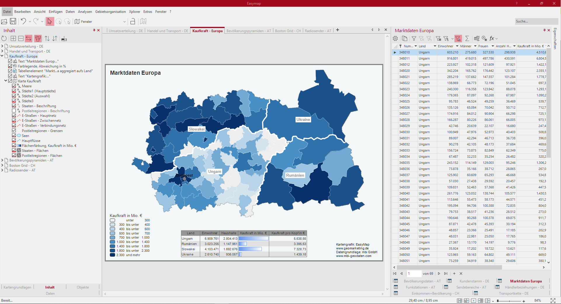
The map shows a section of the map Europe postal code regions of Slovakia, Ukraine, Hungary and Romania. A surface coloration represents the percentage deviation of the per capita purchasing power from the national average.
The table object summarizes the most important key figures for the individual countries. In order to make the table on the map more compact, we have created a query on the imported table with the purchasing power indices for 2-digit postal code regions and aggregated it to the individual countries.
So you can recreate this map:
- Selection of analysis Surface coloring, with the settings: User-defined classification via the data column "Purchasing power in million €"; color gradient via three colors from negative to positive values; Tooltip insert.
- Insert a Color legend from the control window Objects.
- A table object for the query insert market data Europe aggregated to the country and adjust in the settings.
- Insert Text for header and footer.
The following tables were used:
- Market data Europe
Population pyramids AT
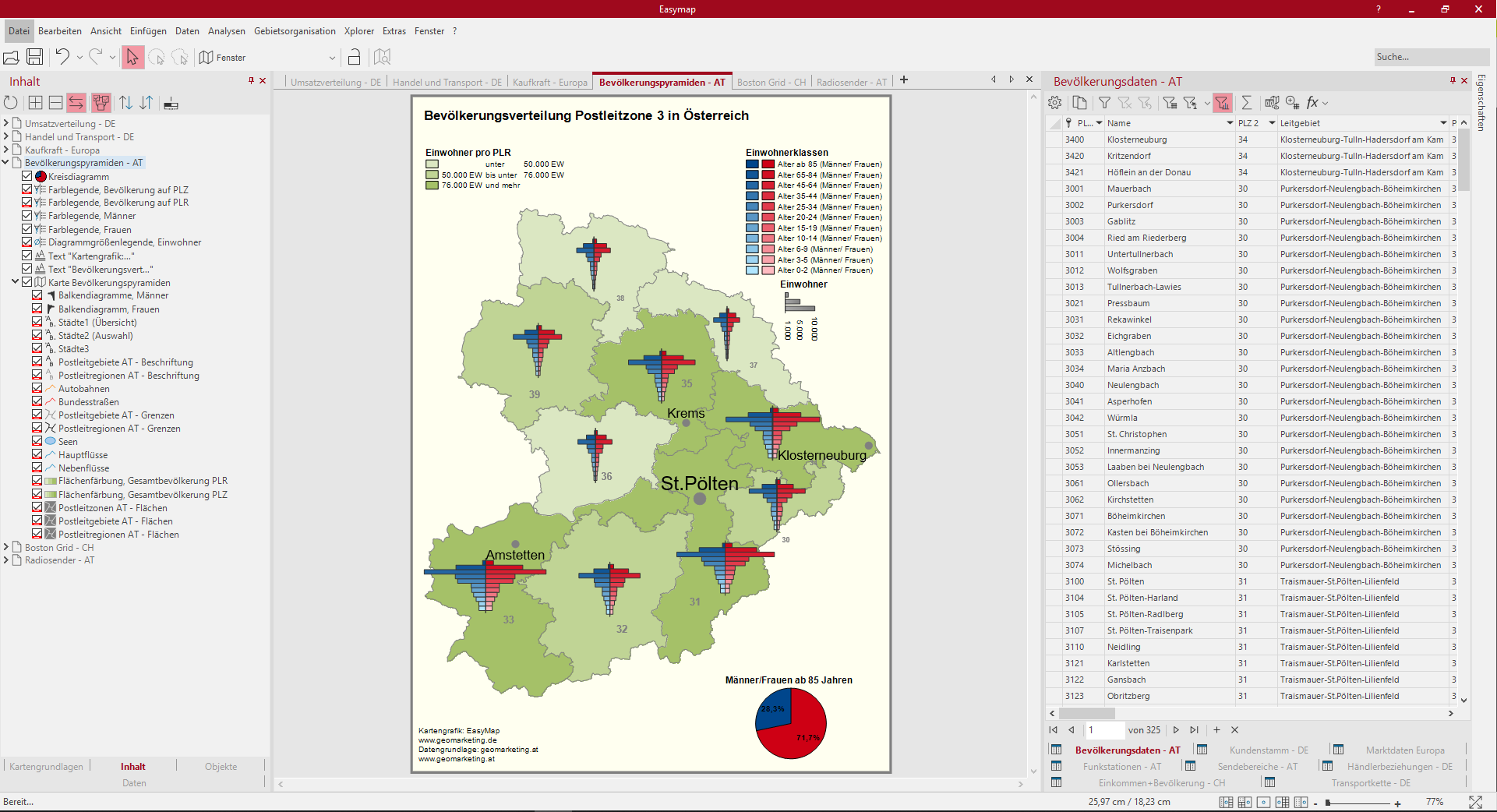
This sheet shows the age distribution by gender and the population distribution at the level of the Austrian postal code regions. Here several surface colorations and bar charts were combined with each other. For a better understanding of the data, tooltips are inserted for the analyses, which display information when driving over the map.
In the overall view of the map, surface coloration is available for the level postal code regions. Only when you zoom into the map does the view change to Area coloring at the postal code level. This visibility change is realized with the Zoomautomatik by setting different visibility levels for the surface colors. The color legends are linked to the different visibilities of the analysis and are only visible when the corresponding analysis is visible. Simply zoom into the map and see what happens to the surface colorations.
The analysis Bar charts is used twice to obtain one chart each for the age distribution of men and women. The chart for the women grows right and the chart for the men others left. By aligning the two bar charts, the familiar image of a population pyramid is created. The two Color legends are also positioned next to each other so that only one label is required for both diagrams. This will prevent the map from appearing too overloaded.
A single diagram is used to highlight the age group with a particularly large difference between men and women.
So you can recreate this map:
- Selection of the analysis Area coloring at the level of the postal code regions with the settings: Classification via data column "Inhabitants" and selection of the classification evenly distributed, Tooltip with the number of inhabitants.
- Selection of the analysis Area coloring at the level of the postal code areas with the settings: Classification via data column "Inhabitants" and selection of the classification evenly distributed, Tooltip with the number of inhabitants.
- In the control window Content the Scale ranges of the two surface colors match.
- Selection of analysis column diagrams with the following settings: select all data columns for the age groups of men, color gradient from light blue for the youngest to dark blue for the oldest age group, set the alignment of the bars to the left in the details.
- Selection of the analysis column diagrams with the settings: select all data columns for the age groups of the women, color gradient from light red for the youngest to dark red for the oldest age group, set the alignment of the bars to the right in the details.
- Selection of the object single diagrams, with the settings: Selection of table "Population data Austria", circle sector diagram, number of data columns to 2, selection of data column "Age from 85 (for men/women)" and definition of colour, size and design of the diagram.
- Color Legend for the area colors and the bar charts. In the legend for the men's bar charts, display the inscription and position it next to the second legend for the women's bar charts.
- Text box for header and footer.
The following tables were used:
- Population data - AT
Boston Grid CH
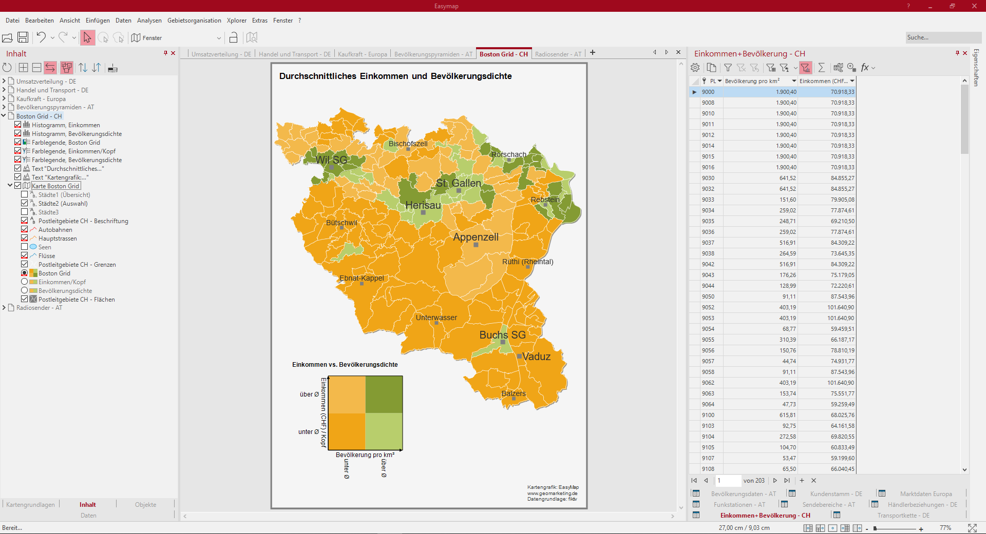
This sheet shows a Boston Grid analysis of the variables "average income" and "population density" for the postal code areas of postal zone 9 in Switzerland and Liechtenstein. For example, it is easy to identify areas with a high average income and a high population density. Two separate surface staining and histograms were also created for the two variables. The three surface analyses were set to visibility setting "mutually visible". To better understand the data, tooltips have been added to the analyses that are displayed when driving over the map.
So you can recreate this map:
- Select the analysis Boston Grid with the settings: User defined classification for two columns each, define colors and insert tooltip.
- Select the analysis surface coloring with the settings: User-defined classification via the column "Population density", define colors, insert tooltip.
- Selection of the analysis Area coloring with the settings Custom classification via the column "Income/Head", Set colors, Insert tooltip.
- Selection Histogram for the two surface colors.
- Select the levels of analysis and assign a name for the Reverse visibility group under Properties.
- Text box for header and footer.
The following tables were used:
- Income+Population - CH
Radio station AT
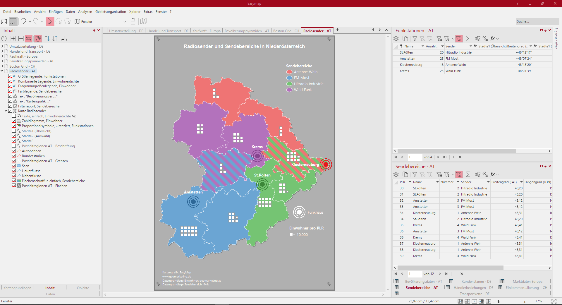
This sheet shows broadcasting areas and radio houses of different radio stations in the Austrian postcode zone 3. Overlaps of the broadcasting areas are shown by means of area hatching within Lower Austria. For area hatching, the areas with several assignments must also be available several times as single rows in the table, because this is the only way to display an area hatched. The radio stations are shown as symbol analysis. In addition, population figures are visible in counting diagrams.
So you can recreate this map:
- Select the analysis area hatching with the settings: Data column "Sender", classification via feature and selection of width and type of hatching.
- Select the analysis symbols with the settings: Selection of a symbol - data-independent, symbol color - data column "Sender" classified by feature and size of symbols - data-independent.
- Selection of the analysis Counting diagram with the settings: Number of segments and color, detail setting (symbol, value per symbol).
- Color Legend for area hatching.
- Text box for header and footer.
The following tables were used:
- Radio stations - AT
- Transmission ranges - AT
- Population per PLR
