
Boston Grid
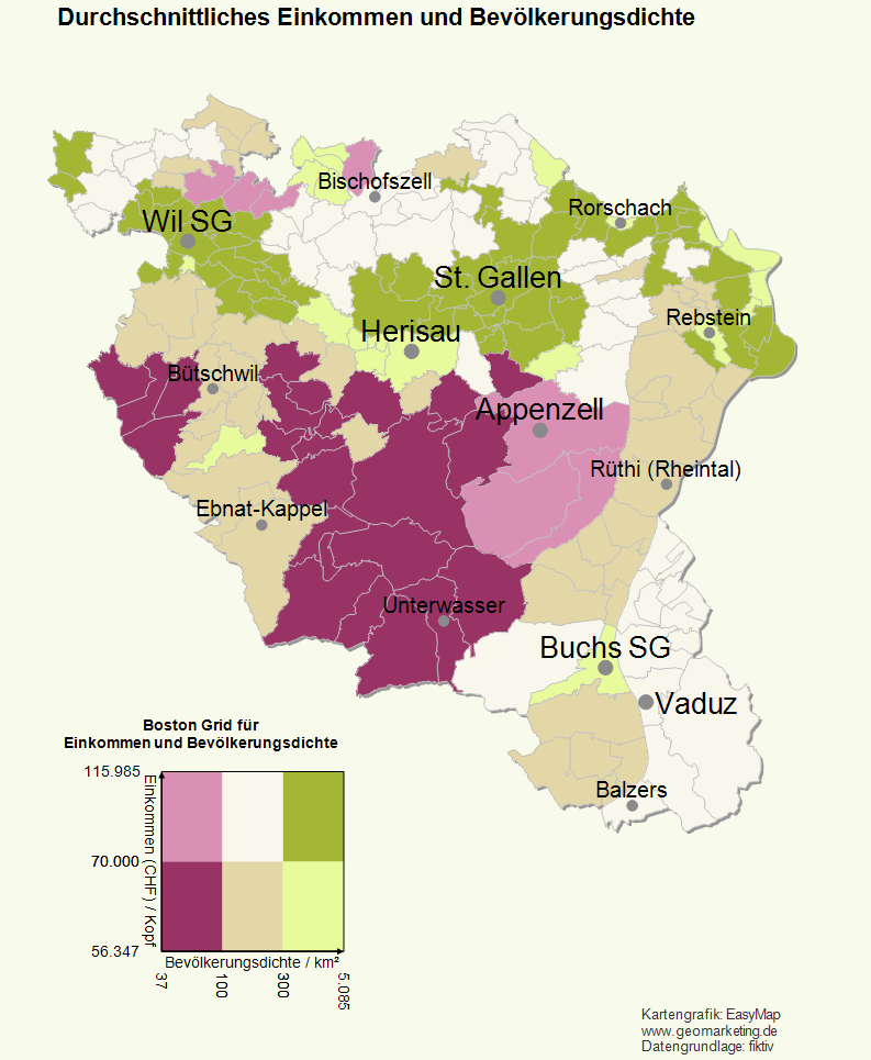
With the analysis Boston Grid EasyMap offers the possibility to color the areas of the areas in the map depending on two data columns. This makes it possible to display the correlation of bivariate distributions. This form of presentation is occasionally referred to as a portfolio or regional portfolio. It is particularly used to compare potential and exhaustion.
Creating a New Analysis
Click on Boston Grid in the menu option Analyze to open the dialogue with the setting options.
The analysis starts with the selection of the data input:
Select data input and connect the data to the map
- First select the Table that contains the data to be displayed in the analysis.
- In addition, you specify on which sheet and in which map the analysis is to be displayed.
- Then check whether the column with the area number (e.g. postal code) from the table corresponds to the corresponding level (e.g. postal code areas - areas) of the base map. The area number is used to assign the individual data records to the corresponding area.
- What does assignment result?
- Would you like to place your data on the map using geographical coordinates? So the Place data using geographic coordinates.
- Via the Advanced button you can specify whether the analysis should consider an existing clip maps in the calculation of classifications - more about Analysis reference.
Set the Properties of the Boston Grid
Properties refers to all settings for calculating and displaying the analysis. You can select certain columns of the previously defined table to control certain aspects of the display (for example, the color). You also reach this settings dialog if you want to edit existing analyses.
In contrast to other anaylses, the Boston Grid uses two classifications (X-axis, Y-axis). By default, two value classes are preset for the selected data columns for each axis - one class contains the below-average data, the other value class contains the above-average data (classification: Average). The combination of the value classes of each data column results in a value class grid, which is displayed by EasyMap in an X/Y diagram - under Boston Grid Tableau. You then assign a color to each combination of value classes.
- First select the two data columns to be analyzed under X-Axis and Y-Axis. You want to compare potential and turnover and thus select the column "Potential" for the X-axis and the column "Turnover" for the Y-axis. You then define the value classes for each column separately.
- With a area-related analysis you can additionally determine aggregation of the data of the selected column. This specifies the rule how data are combined if several data are available for an area.
-
The Format option is only available for area-specific analyses. Normally, the formatting of the selected data column is also used for the analysis result; this is always the case for site-specific analyses. For certain aggregation procedures (for example, number of values), however, this formatting cannot be used meaningfully. You can define a new formatting here, which is used in legends for this analysis, for example.
- Under Statistics you can display statistical information (e.g. number of data records, min., max.) for the selected column - click on the button in the field next to Statistics.
- In the middle area, enter Classes, the Count for classes, and the method of automatic Classification or set here to User defined to edit your own classes. In addition to Analysis range, you can also specify an interval within which the values are to be taken into account. Values outside the interval always fall into the residual class "unclassified".
- In the lower section you can then determine the details of the analysis (Value class list). Here you can use various commands to edit the value classes.
- You can change the class limits by double-clicking on the relevant cell.
- For more information on how to edit value classes, see here.
Note: By sorting according to the name of the class, you can force a certain order in the legend!
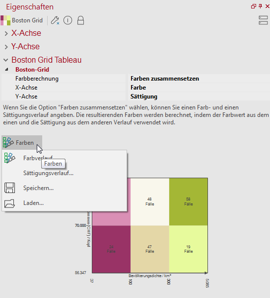
Under Boston Grid Tableau you can see in an X/Y diagram the currently set class combinations with the respective value range and color. The colors can either be composed by the option Color calculation or set using a predefined color matrix.
Compose colors
Here you can specify that one of the two classifications of the X-axis and Y-axis determines the color shade, the other one determines saturation (color intensity). You can change the colors directly by double-clicking into the tableau or set a color gradient using the ColorColor gradient... button. Again, EasyMap allows you to save the selected colors and recall them if necessary (button Load... ). The load button also gives you a choice of the color palettes provided.
The Saturation gradient... button is used to adjust the saturation intensity and the gradient from dark to light or light to dark, starting from the origin of the coordinates.
Predefined color matrix
Here you have the possibility to load or save colors. These are the colors you can see in the tableau graphic shown.
Note: Avoid mixed colours. EasyMap offers you the possibility to use standard colors (button Restore default colors), which allows a well understandable visualization.
Determine the details of the analysis
In Details you define other (non-data-dependent) properties of the analysis.
| Visibility | |
| General |
Here you can control the visibility of objects and elements. |
| Scale range |
Here you can set whether the selected object or plane should be visible at each scale. Or you can specify the scale or zoom level at which the object or layer is visible. |
| In reports |
In Reports there is the possibility to change the environment only partially to zeigen. You can use this property to specify whether the layer is also visible outside the report area in this case. |
| Alternating visibility group |
Set a group for mutual visibility here. If the element is to be made equally visible with other elements, you must use the same name for the visibility group. |
| Simultaneous visibility group |
Set a group for simultaneous visibility here. If the element is to be made mutually visible with other elements, you must use the same name for the visibility group. |
| Common | |
| Type of Shading | Here you can select whether the color of the areas full area or only as edge color should appear. With this option, loosened maps are possible, which allow not only the analysis of the surface coloration but also a further evaluation, without the map appearing overloaded and not really readable. |
| Comment | Enter here a comment for the display of the workbook in EasyMap Xplorer. The comment is also displayed in EasyMap as a tooltip in the control window Contents. |
Create tooltips for analysis
When crossing the colored areas on the map, you can display context-sensitive information about them.
Note: You can find out how to implement tooltips here.
