Table
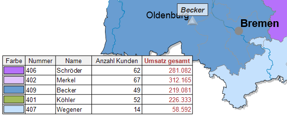
While the table views in the data window are intended for working with and planning with the data, the Table object is used to display tabular data on the Sheet, i.e. they are displayed not only in a map and other objects, but also in printouts and exported files (graphics, Office exports). The table object is purely passive, that is, it can display the data but does not allow editing.
The displayed table can be modified for this purpose using numerous settings. For example, fewer or different columns can be made visible than are displayed in the table view. A separate filter can also be set. As in the table view, you can specify the formatting of the numbers or display numbers in the form of bars.
Inserting a table on the map sheet
Simply add the table object via Drag&Drop from the control window Objects or Data to the sheet or via the menu Insert > Other objects > Table and click on the corresponding map sheet.
Properties
The setting options in detail:
| Caption and Editability | |
| Caption |
Specify a name here to be able to find the element more quickly in the Contents control window. For analyses, maps or sheets, you should use a name that contains the topic. EasyMap assigns generic names for new elements (e.g. map 1). If you do not change these, you will later have great difficulty in finding certain content in workbookn. |
|
Visibility |
|
| General |
Here you can control the visibility of objects and elements. |
| Alternating visibility group |
Set a group for mutual visibility here. If the element is to be made equally visible with other elements, you must use the same name for the visibility group. |
| Simultaneous visibility group |
Set a group for simultaneous visibility here. If the element is to be made mutually visible with other elements, you must use the same name for the visibility group. |
| Reference | |
| Table |
The table on which this table object is based. Note: If you convert an existing table object to a new table, some settings (for example, column visibility, filter) cannot be transferred and must be reset. |
| Location | |
| Anchor point |
Select the point from which the size of the element is to be calculated.
|
| Offset Left |
In conjunction with the reference point, the distance in cm from the left. |
| Offset from Top |
In conjunction with the reference point, the distance in cm from the top. |
| Size | |
| Width |
Width of the object in cm. |
| Height |
Height of the object in cm. |
| Header | |
| Content |
Heading of the legend, table or single diagram or of the text to be displayed in the map. As a rule, the text is output via a text macro (you can recognize text macros by their curly brackets). For analyses, the wording of the legend consists of the name of the column used for the analysis. You can use additional text macros for the heading. For example, you can use a text macro to force the system to display the name of the analysis or the names of the table used. To do this, expand the text box next to the Header setting and click Text Macros > Analyse, then select Name or Table Name. More information on the individual expression categories of text macros can be found here. |
| Alignment |
Here you can set how the text is aligned (within the legend or table). |
| Font |
Defines the font of the content. |
| Font Color |
Specifies the font color of the content. You can specify the color using the color selection field or directly as an HTML color value. |
| Content | |
| Font |
Defines the font of the content. |
| Font Color |
Specifies the font color of the content. You can specify the color using the color selection field or directly as an HTML color value. |
| Line Spacing |
To make the legend easier to read, you can increase the line spacing between the individual elements. |
| Border | |
| Color |
Specifies the color in which the frame around an object is to be drawn. You can specify the color using the color selection field or directly as HTML color value. If no color is specified, no frame is displayed. |
| Width |
If a frame is displayed around the object, the width of this frame can be set here. |
| Shadow Color |
Specifies the color in which a shadow representation of the object is to be drawn. You can specify the color using the color selection field or directly as HTML color value. If no color is specified, no shadow is displayed. |
| Shadow Spacing |
If a shadow is displayed to the object, the distance or width of this shadow can be set here. |
| Background | |
| Fill |
Define the background of your element here. You can specify the color or the fill effect using the Color Selection Box or directly as HTML color value. |
| Columns and rows | |
| Max. number of visible rows |
Tables can contain many rows. They can then no longer be displayed sensibly on a sheet and take a long time to be displayed. The table object is not intended for displaying very large tables, nor is it optimized for this purpose. Therefore, the maximum number of data rows displayed is limited by this property. |
| Indicator for additional rows |
If the setting in Max. does not display all data lines, a last line is displayed to indicate this. In this row, the text entered here is displayed in the cells. To prevent such a line from being displayed, clear this field. In this case, the entire line is no longer displayed. |
| Column width |
Specify how the column widths of the table are to be calculated. Column header + content: The width is set so that all texts of the cells and the heading text fit into the column (taking into account the setting in Max. considered text length). Content: The width is set so that all texts of the cells fit into the column (taking into account the setting in Max. considered text length). The heading is not taken into account. Column header: The width is set so that the heading text fits into the column. User-Defined: The width is set to the current width and is no longer automatically adjusted if the contents of the table change. To change the column widths manually, start Content editing of the table object and move the column headers there. |
| Max. text length |
If you use an automatic calculation when calculating the column width, it can happen that individual particularly long cell contents lead to extremely wide columns that are unusable in this way. Here you can set the maximum number of characters to be taken into account when calculating the fitting of the texts. This can be used to force the columns to have a reasonable width and to accept that individual texts run out of the cell and are cut off. |
| Transpose |
yes: The table is rotated 90°. The columns become rows and vice versa. The headings are in the first column on the far left, followed by the data values on the right. No: The table is displayed normally. Note: In this case, the Max. displayed data rows setting determines the maximum displayed data columns! In this case, column widths are always calculated automatically, since the columns now have a completely different structure. Column headings can only be displayed horizontally. |
| Header | |
| Visible |
Here you can set whether your header line should be displayed and if so, whether as the first line or as the last line. |
| Fill |
Set the background color of the heading area here. You can specify the color or the fill effect via the color selection field or directly as HTML color value. |
| Text alignment |
Here you can set the alignment of the texts in the heading area. Note: The texts of the headings are often many times longer than the data values of the same column. Depending on the setting in column width calculation, either the columns are unnecessarily wide or the heading is not readable because it does not fit into the cell. In this case, it may help to place the heading obliquely or vertically so that both goals can be achieved. |
| Data area | |
| Visual Style |
Set the color scheme of the table here. Uniform: All cells are colored with the same color. Alternating: 2 colors are used, whereby the lines are colored alternately with one or the other color. In this case the additional property Filling (2nd color) appears. |
| Fill |
Set the background color of the cells in the data area. You can specify the color or the fill effect via the color selection field or directly as HTML color value. |
| Filling (2nd colour) |
Here you set the alternating second background color of the cells of the data area. You can specify the color or the fill effect via the color selection field or directly as HTML color value. |
| Sum Row | |
| Visible |
Here you can set whether a totals line is to be displayed and if so, whether as the first line or as the last line. |
| Fill |
Set the background color of the cells in the data area. You can specify the color or the fill effect via the color selection field or directly as HTML color value. |
| Labeling |
Enter the label text for the totals line here. The display appears in the first column. |
| Cell margins | |
| Color |
Set the color of the cell edges here. You can specify the color or the fill effect via the color selection field or directly as HTML color value. |
| Width |
Set the width of the cell edges here. You can specify the color or the fill effect via the color selection field or directly as HTML color value. |
| Displayed margins |
Here you can set which lines are to be displayed in the table. |
Select the visible columns of the table here. In addition to the column settings, you can also filter and sort the table to be displayed here. The settings only apply to the table on the sheet, regardless of the view settings of the source table.
| Filter | The filters allow you to show only a limited view of the data, e.g. by applying the current clip map to the table. The table with the area display is then correct. Of course it is possible to set your own table filters. |
| Sort table | Select a column according to which the table is to be sorted in ascending or descending order. |
| Column properties | |
| Edit | Select the columns you want to display as the result on the sheet. It is also possible to add a special character (such as €) to the numbers displayed. |
| Reset | All column settings that you have made specifically for this table element are reset to the current settings of the source table. This affects visibility, formatting, column headers, and display variants. |


