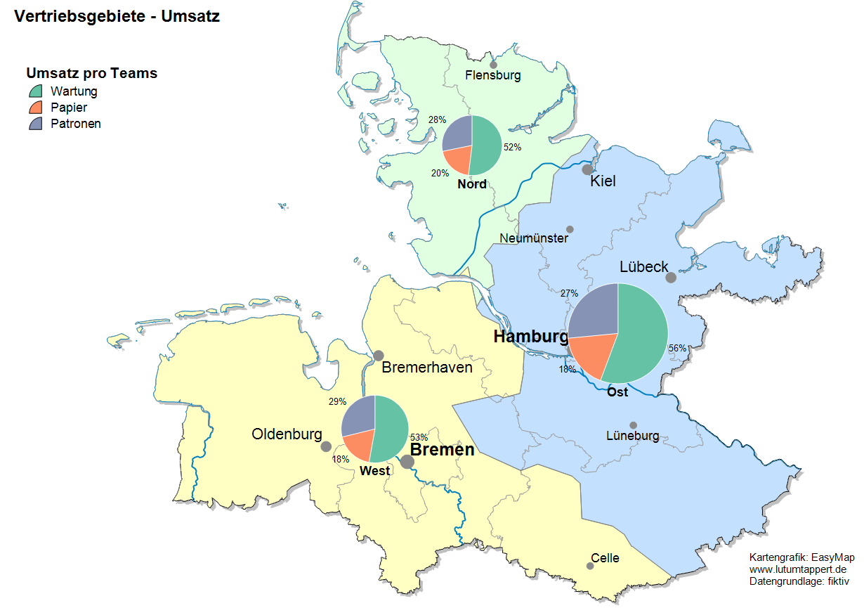
Pie Charts
Pie charts are essentially suitable for distributions and percentages representation, but less representative for comparing absolute values.
Creating a New Analysis
The analysis circuit diagrams insert data via the control window Select one of your data columns and place it onto the map using drag and drop.
First, you decide the type of analysis and its subtype. Wing chart analysis has segments arranged at the same angle with their radius representing the value. Pie chart segments display in a circle with their angle representing the percentage. Both Wing and Pie charts have similar settings.
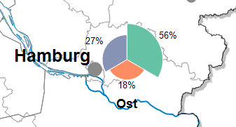
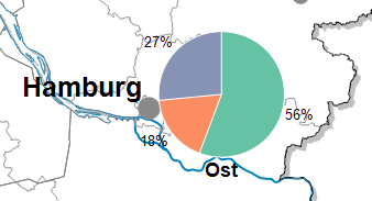
Figure: Wing chart (left) and pie chart (right)
You can choose between a site-related and a area-related representation of the diagrams. The analysis type determines whether a diagram is generated per area (area-related) or per data set (location-related).
After selecting the analysis type, continue with the selection of Layer and Assignment.
Note: You can also insert your analysis via the menu bar Analyze. You get an analysis without predefined settings and value classes.
- What does the assignment result tell you?
- Would you like to place your data on the map using geographical coordinates? So the The Data Input for an Analysis.
- The Advanced button allows you to specify whether the analysis should consider an existing clip map when calculating classifications - more on the analysis reference.
Set Properties of the Analysis
Properties refers to all settings for calculating and displaying the analysis. You can select certain columns of the previously defined table to control certain aspects of the display (for example, the color). You also reach this settings dialog if you want to edit existing analyses.
Chart
Under Diagram you define which data the diagram should display. You can also specify the coloring and size proportions of the diagram and other diagram options.
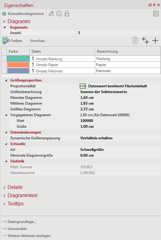
- In the Segments sections, select the Count of sectors to be evaluated. Only number columns are used for the evaluation. In the list, the columns appear as they are listed in the table.
- Now select per sector the column to be evaluated in the column data. The name of the column appears under Column Name as the name of the column for the legend (you can also change the legend accordingly). The maximum number of possible sectors corresponds to the number of number columns in the selected table.
- With the button
 - Insert sector an additional column can be added. The button
  - Insert all sectors adds all number columns of the table to the selection with one click.
To delete a column, select the column and press the trash button or press the Delete key on your keyboard.
You can change the colors of the individual sectors under the button Colors Load, Save or use a Color gradient to control. Moreover, each color can be controlled individually by double-clicking on the respective color field. Besides defining the color, each sector can also contain specified filling properties such as hatching or shading. You can use the preview button to visualize the pie chart on the map.
Via the Load button under Colors you can access a series of color palettes prefabricated in EasyMap or you can navigate to a color palette (.pal file) individually compiled by you. The color palette file is created via the Save button.
In the area size proportion EasyMap offers the possibility not only to define the sizes for the smallest or largest diagram, but also to influence the proportionality of the diagrams.Three options are available for Proportionality:
| Uniform Size | All charts appear in the same size. Differences arise mainly from the ratio of the data. |
| Value specifies radius | The underlying data value determines the width or height of the chart. A value twice as high results in a chart with twice the height and width (this means that the area of the chart quadruples). In this way, the differences between the diagrams are emphasized more strongly. |
| Value specifies area | The underlying data value determines the area of the chart. A value twice as large leads to a chart with twice the area, i. e. a chart with only about 1.4 times the height and width. This calculation prevents a too strong increase of the symbol sizes. When looking at a map, the area of a symbol is perceived first and foremost, so this variant is also the recommended option. |
| Sizing |
Specify here whether the size of the pie charts is calculated using the Sum of sector values, or a Single column. If you have selected a single column, you can now also select the column from the table. |
| Smallest, average and largest chart |
You can specify the size of the displayed symbols here. You use the three properties to define a common proportionality factor that specifies the conversion between the data value and the diagram size. Therefore, changing one of the three values automatically leads to the adjustment of the other values. Due to the underlying data and proportionality, there is a complicated relationship between the three reported values. |
| Specific Chart |
Enter the value or the size for a diagram. An entry in the Size area also automatically changes the values for the smallest/medium/largest diagram. An entry in the range Value leads to a corresponding conversion for the size of the diagram, but not for the specifications of the smallest/medium/largest diagram. |
| Data Update | |
| Dynamic sizing |
Here you can set how the diagrams should behave when data is changed. Preserve ratio: The conversion factor between the incoming values and the size of the diagram is retained even after data changes. If, for example, considerably larger values are obtained after a data change, you will also receive larger diagrams. Get maximum diagram size: The maximum diagram size you specify is also guaranteed after data changes. However, this means that the diagrams are scaled differently, i.e. the conversion factor between the input values and the diagram size must be adjusted. |
|
Note: If you want to use a chart analysis to display highly variable data and prevent charts from growing too large, use the second option. If the comparability of the diagrams is in the foreground, use the first option. |
|
| Threshold Value | |
| Type |
Here you can determine a threshold or a threshold that a diagram must have at least to be displayed. |
| Statistics |
Here you can find the statistical values for the total diagram. They can be used to help determine suitable diagram sizes. Average Sum: For each row, calculates the row total for the selected columns and returns the average of all rows. (Average total = total sum / number of table rows). Total: Displays the sum of all selected columns and rows. |
Determine the details of the analysis
In Details you define other (non-data-dependent) properties of the analysis.
For example, you can influence the sorting of the sectors under the entry style , or under Data Labeling you can have the individual sectors labeled with values or percentages.
| Visibility | |
| General |
Here you can control the visibility of objects and elements. |
| Scale range |
Here you can set whether the selected object or plane should be visible at each scale. Or you can specify the scale or zoom level at which the object or layer is visible. |
| In reports |
In Reports there is the possibility to change the environment only partially to zeigen. You can use this property to specify whether the layer is also visible outside the report area in this case. |
| Size adjustment |
Specify here how the size of a symbol or diagram behaves when the map scale is changed. This can change e.g. after zoom within the map, after setting a clip map or within a report, because only a part of the map is displayed. More about Size adjustment at auto zoom. |
| Alternating visibility group |
Set a group for mutual visibility here. If the element is to be made equally visible with other elements, you must use the same name for the visibility group. |
| Simultaneous visibility group |
Set a group for simultaneous visibility here. If the element is to be made mutually visible with other elements, you must use the same name for the visibility group. |
| Style | |
| Sort table |
Allows you to sort the circle segments or bars according to the size of the class. You can sort the bars or sectors either Descending or Ascending. The Appropriate Definition option sorts the bars/segments in the order in which they were selected when the analysis was created (see Order in the Diagram tab). |
| Exploding Sector |
Specifying an exploding sector helps you to focus on a part of the pie charts. You can only select a sector for this from the previously determined data columns. |
| Starting Angle |
Setting the start angle allows you to put the important data in the foreground. |
| Show original location | |
| Here you can determine what happens when a diagram is moved. Here a line can indicate the original position and thus an easier allocation of the data and orientation can be achieved. To display the original position for all diagrams, select all diagrams in the map and open the Properties of the several selected objects from the context menu. In the Display item, you can specify that the original position should be displayed (select Yes setting). | |
| Style, Line Width, Line Color, Start, End | Here you can set how the arrows between text and position point are to be displayed. You can specify the start and end points of the lines, the line width/color, and the style. Applications and other settings for the original position indicator can be found here. |
| Data Labeling | |
| Format |
With Formatting of the numbers you can specify whether large numbers with thousands separators are displayed more legibly, or small numbers with many or few decimal places are drawn. |
| Label Options |
Here you can define whether the diagrams are always labeled or only if there is enough space. |
| Content |
You can label the diagrams with value, percent or name. All labeling elements can also be displayed simultaneously. If you deselect all check marks for the content, no label will be inserted and all properties in the Data Labeling section have no meaning. |
| Label Position |
The label can be placed either Outside or in the segment. |
| Font, Font Color |
Set here the font and size as well as the font color. |
| Margin | |
| Border Color and Border Width |
Specify a color and a width for the edges of the circle segments or bars of the diagram. |
| Common | |
| Comment | Enter here a comment for the display of the workbook in EasyMap Xplorer. The comment is also displayed in EasyMap as a tooltip in the control window Contents. |
| Shadow | |
| 3-D Shadow |
In addition to the shadow display, you can also select 3D shading to make the objects appear three-dimensional. This variant may not be supported by all printers. |
| Shadow Color |
Specifies the color in which a shadow representation of the object is to be drawn. You can specify the color using the color selection field or directly as HTML color value. If no color is specified, no shadow is displayed. |
| Shadow Spacing |
If a shadow is displayed to the object, the distance or width of this shadow can be set here. |
Labeling
In addition to the labeling of the sectors, each chart can also have a label that applies to the entire chart (for example, the name of the area to which the chart refers). The settings for this are defined under Labeling.
- If the analysis area-related is created, EasyMap offers the possibility to label each symbol or object with the name or number of the corresponding area (geographical data).
- With the analysis subtype Location-related, however, only the columns of the data table used as the data basis for the analysis can be used for labeling.
Note: How to insert diagram texts and how to influence the display of the texts can be found here.
Tooltip
When driving over the diagrams on the map, you can display user-defined information about them.
Note: You can find out how to implement tooltips here.
