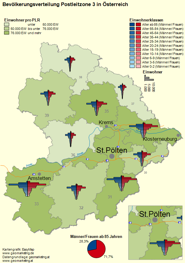
Population Pyramids
Population pyramids graphically represent the age distribution of the population separated into women and men. With easymap you can easily display the age structure of a territorial unit, e.g. districts or postal regions, in a map with the analysis bar charts.
The example from the figure below can also be found in the sample map folder Analyze. You can open it directly from easymap via the menu ? - examples.
Instruction
To create a population pyramid or age pyramid, please follow these steps
Data input
You need a table with data columns per age group and gender at any area level (e.g. at the level of postal codes or districts). In easymap, the data should be either imported or linked.
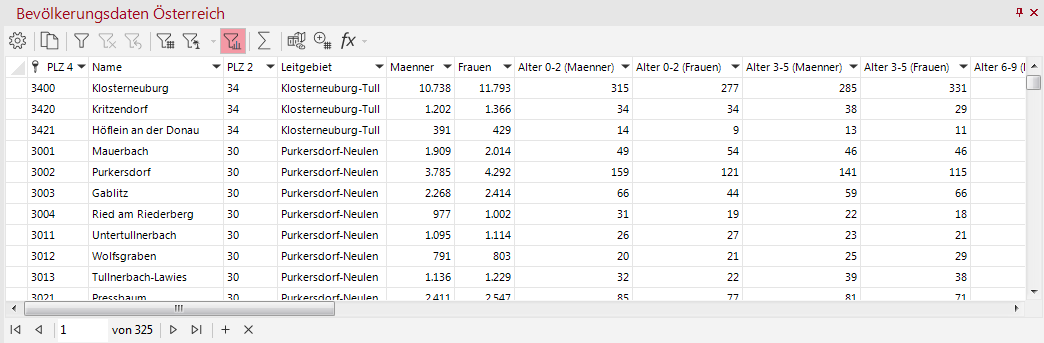
Insert a Base Map
Next you have to decide which area level the population pyramid should refer to. In the table above, the data is broken down by both the 4-digit postal codes and the 2-digit postal code regions. In this example we use the 2-digit postal code regions.
- In the control window base maps select from the demo maps the 10 postcode regions from the folder Austria, postcode zone 3 and insert them by drag and drop on a blank sheet.
Create a Bar Chart Analysis
Afterwards you can also immediately create the analysis. To do this, select the corresponding table column for column/bar charts from the control window data and drag and drop it onto the map using drag and drop.
- Select the analysis type Basic: The bars are arranged above each other and the subtype Area based. The area based type summarizes the data for an area and generates a diagram for each area in the map.
- In the next step, choose and assign the imported table. Please read the article on Level and Assignment.
- Ok.
Note: You can also insert your analysis via the menu bar Analyze. You get an analysis without predefined settings and value classes.
Select the data columns
Initially, only the age groups for men are selected as data columns in this analysis. In this example, there are a total of 11 bars per gender.
- In the Chart section insert 11 for the entry Count. In descending order choose the 11 different age groups for men in the column Data.
- Click on the button Colors > Color gradient... to set a gradient from dark to light blue.
- Under the list of the data columns specify a Linear Proportionality. In the section Specific Chart enter a fixed value (here: 10,000 for the size 1.00cm). You can keep all other settings.
- Further data-independent settings can be made in the Details of the properties, e.g. in this example we have increased the width of the bars to 0.15 cm (section Displays)
Aligning Bars
In addition, the alignment of the bars can be defined under Details - either To the Right or To the Left.
- For the bar chart of the men, set the alignment to the left.
- Create a second bar chart analysis for the female age groups. Proceed in exactly the same way as the first analysis, except that you assign a different Color gradient (here dark to light red) to the bars and align the bars to the Right.
Insert the legend
To insert legends, open the navigation window Objects or navigate to the menu Insert.
- Add a Color Legend from the section Legend Elements to the sheet for the bar charts of women and men.
- In this example we have removed the name of the color classes of a legend and adjusted the name for the bar charts of the women. You can change the names of the classes in the legend by opening the properties of the analysis again (right-click on the analysis Bar Charts > Properties in the control window Content) and adjusting the column Name of the bars under Chart.
- You can align the legends with each other by holding down the Ctrl key, selecting both legends and using the functions under Align in the context menu. You can also move the legends on the map manually.
On the map shown above, further analyses have been added - more about this can be found in the description of the example map folder.
