Accessilibity
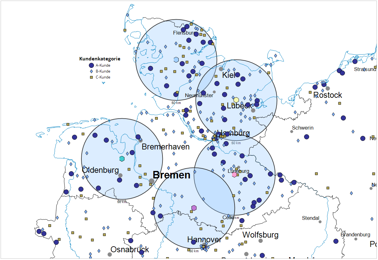
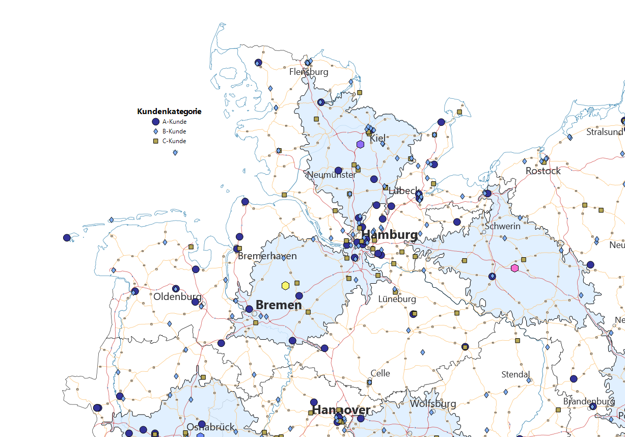
With the Accessibility analysis, you can display circles or contour lines around a list of points or locations on the map. You enter the radius of the circle / isoline in kilometers or minutes. You can also specify the color and line width of the border and the filling of the areas. This analysis is useful, for example, to represent "theoretical" or "ideal" catchment areas of sites and thus compare these with the actual catchment areas or areas of responsibility.
You insert the analysis via the control window data per drag&drop. After selecting the type of analysis and the assignment, the circumcircles are inserted directly into the map after clicking on Ok.
Note: You can also insert your analysis via the Analysis menu. You will receive an analysis without predefined settings and classes.
You will now first receive the accessibility as the crow flies. You now have the option to choose between the following settings in the properties of the analysis:
- As the crow flies:
A perimeter is drawn around all locations at a given distance. - Travel time/distance*:
An isochrone is drawn around all locations, which corresponds to the accessible area according to travel time or distance. For satisfactory calculation times we recommend to use a maximum of about 100 data sets for the analysis. - Journey distance*
You get around each record an isochron, which now takes into account the scheduled travel time. For satisfactory calculation times, we recommend using a maximum of about 100 data sets for the analysis.
Note: The available options depend on the license you have purchased. This feature is only available if you have the extensioneasymap office pro or easymap professional. For each object drawn, credits are deducted from your quota. The more data records your table contains, the more credits will be deducted.
Since credits could be deducted when switching to drive time/drive distance, switches easymap automatically into Do not apply changes immediately mode. This way you have the possibility to make all the settings first and then confirm the selection with OK or Apply . Only then will the data be evaluated and credits billed, if applicable.
- What does the assignment result tell you?
- Would you like to place your data on the map using geographical coordinates? So the The Data Input for an Analysis.
- The Advanced button allows you to specify whether the analysis should consider an existing clip map when calculating classifications - more on the analysis reference.
Set Properties of the Analysis
First of all, the circles in the map have uniform edge colors and radii - they are therefore not influenced by no data column. The color and radius of the circles can now be edited in the opening properties window. Changes of color and radius are applied to all circles.
Control border color and radius from different data columns
However, you can also have the border color and radius of the circumcircles controlled by different data columns. To do this, select the column to be controlled for these properties in the corresponding areas Edge Color or Radius.
The border color of the reachability can be differentiated here either classified, continuous or by a predefined color value (selectable under data evaluation).
- Classified: You can use classes to specify a schema that determines how these are to be displayed for a range of values. When the analysis is presented, the class in which the value falls is then checked and the presentation of the design characteristic concerned is determined from this.
- For more information on how to create value classes, see here.
- Continuous: This option colors the circles without specifying value classes in a continuous color gradient depending on the selected data column. The continuous coloring of the symbols is only possible for number columns. As with the classified option, you can restrict the analysis area, define a gradient or set the color outside the analysis area.
- Preset: With the option Preset a color value in HTML color definition (e. g. #00FF00) can be retrieved directly from the data.
The radius of the perimeter can be set in this area depending on a data value classified or proportional (selectable under data evaluation). The radius of the radius is given in kilometers for the air-line distance and the road distance and in minutes for the driving time in the accessibility (selectable under Type of calculation).
- Classified: You can use classes to specify a schema that determines how these are to be displayed for a range of values. When the analysis is presented, the class in which the value falls is then checked and the presentation of the design characteristic concerned is determined from this.
- For more information on how to create value classes, see here.
- Proportional: The size and width are calculated continuously based on a factor derived from the data values that are analysed. The data value defines...
- ...height/width: The symbol height and width is calculated linearly taking the data value into account. This implies that the symbol sizes vary rather strongly. More information.
- ...Surface Area: The symbol surface results directly from the data value, i.e. the symbols differ less strongly in size. More Information.
- Size/Width: Insert the required size for the symbols here. Thus, you can directly determine the factor that controls the symbol’s size.
- Dynamic Driving time:
- Preserve ratio: This setting maintains the value entered in the 1.00 cm equivalent to field.
- Preserve max. symbol size: This setting maintains the value entered in the Maximum field.
Set the size of the circle in kilometers at radius. The perimeter can be a colored fill and a frame color and the frame width of the circle can be determined.
Here you can learn how to adjust the colors for the fill and the frame color.
The properties of the circumcircles can only be controlled from one column
If you want the color and radius properties of the perimeters to be controlled by one and the same column, you must first link the analysis. The Link Edge Color and Radius function can be found either in the analysis Properties (at the bottom of the Properties window) or in the analysis context menu in the control window Contents. After you execute the command, the structure of the Properties window changes.
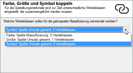
If you select this option and have previously selected different data columns for one or more design features, another dialog opens. There you will be asked which classes should be used for coupled classification?
Select one of the three settings offered here that were already defined for color, size, or symbol. In the linked symbol analysis, the system tries to combine the classes set so far using the data column selected here. Then check the output value classes in the area Display.
Select column
In the area Display a Column can now be selected, which controls the characteristics Edge color and Radius simultaneously. These are combined in a value class list, Number of classes and classification method
In the middle area, enter Classes, the Count for classes, and the method of automatic Classification or set here to User defined to edit your own classes. In addition to Analysis range, you can also specify an interval within which the values are to be taken into account. Values outside the interval always fall into the residual class "unclassified".
Edit classes
In the lower area you can then determine the details (class list) of the analysis. Various commands are available here to edit classes and design features.
- The design characteristics and class boundaries can be edited by double-clicking in the relevant cell.
- for further information on editing classes, symbols, colors and sizes, see here.
Determine the details of the analysis
In Details you define other (non-data-dependent) properties of the analysis.For the circles you can set e.g. a fill or the line width of the circle.
| Visibility | |
| General |
Here you can control the visibility of objects and elements. Choose between never visible, always visible or scale dependent visible here. The last option provides the settings for Automatic Zoom. |
| Scale range |
Here you can set whether the selected object or plane should be visible at each scale. Or you can specify the scale or zoom level at which the object or layer is visible. |
| In Reports |
In Reports there is the possibility to change the environment only partially to zeigen. You can use this property to specify whether the layer is also visible outside the report area in this case. |
| Shadow Color |
Set a group for mutual visibility here. If the element is to be made equally visible with other elements, you must use the same name for the visibility group. |
| Simultaneous visibility group |
Set a group for simultaneous visibility here. If the element is to be made mutually visible with other elements, you must use the same name for the visibility group. |
| Common | |
| Comment |
Enter here a comment for the display of the workbook in EasyMap Xplorer. The comment is also displayed in EasyMap as a tooltip in the control window Contents. |
| Style | |
| Fill | Defines which fill color the circles should have. Under Fill Effects, you can specify transparency, hatching and even a pattern. |
| Shadow | |
| Class Label |
Specify whether the entire isoline should be displayed, or only the areas that lie within the island. |
| Show element if |
Set here when an element is to be evaluated within an area. You can distinguish between: |
| Miscellaneous | |
| Line Width | Defines the width that the isoline must have. |
Labeling
In the area symbol text the circles can be labeled. Only the columns of the data table used as the data basis for the analysis can be used for labeling. For example, you can assign a name and location number to the radius for each individual location. In addition, a standard text (e.g. the km specification), which is displayed for all circles, can be entered at user-defined labelling.
Note: How to insert symbol texts and how to influence the display of the texts can be found here.
Tooltip
As you move over the circles in the map, you can display custom information about them. This information can be a great help in identifying the displayed circumcircles independently of the label.
Note: You can find out how to implement tooltips here.
