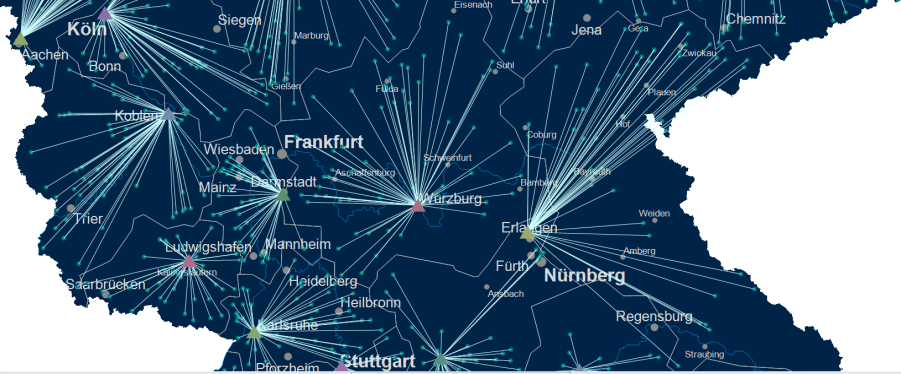
Relations
With the command Relationships in the menu Analyses easymap offers the possibility to display relations between areas or locations on the map (e.g. commuter relations, migration, flow of goods or purchasing power). For this purpose a line or an arrow is generated for each relationship between two areas or locations.
Structure of Input Data
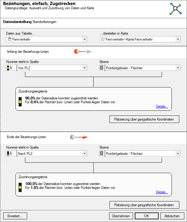
To be able to display relations between two locations, easymap must know both the start- and the endpoint. Accordingly, the data basis must contain columns (e.g. postal code or longitude and latitude) that define the two locations exactly. In contrast to all other analyses, there must therefore be at least two columns with area numbers (for example, postal code). If the placement is carried out via geographical coordinates, even four columns are necessary, because both for the start point and for the end point one column with the geographical latitude and one column with the geographical longitude are required. For a placement via the address, two complete addresses must also be available.
It is not, however, necessary to define both starting points and end points in the same way: one location may be positioned by its postcode, and the other by geographic coordinates.
Creating a New Analysis
- Start the analysis from the control window data and drag and drop the table column by which the relationship is to be formatted onto the map using drag and drop.
- Select the Analysis Relations off.
- Select table with the data for the beginning and end of the relationship lines.
- Start the analysis from the menu Analyses > Relations.
Note: You can also insert your analysis via the menu bar Analyze. You get an analysis without predefined settings and value classes.
- What does the assignment result tell you?
- Would you like to place your data on the map using geographical coordinates? So the The Data Input for an Analysis.
- The Advanced button allows you to specify whether the analysis should consider an existing clip map when calculating classifications - more on the analysis reference.
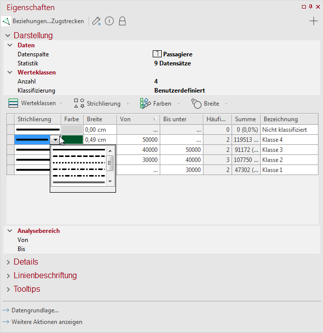
Setting the Properties of Relation Lines
Properties refers to all settings for calculating and displaying the analysis. You can select certain columns of the previously defined table to control certain aspects of the display (for example, the color). You also reach this settings dialog if you want to edit existing analyses.
The lines or arrows can be made dashing, color and line width dependent on different columns. For example, if the dashed line represents the means of transport used (car, public transport, bicycle), the width can be used to visualize the number of commuters and the color can be used to visualize the gender of the commuters.
You can also use the details section to specify how your route should be displayed. Choose between straight-line distance, travel time, and driving distance, and view the exact routes and distances.
Note: The available options depend on the license you have purchased. This feature is only available if you have the extension easymap office pro or have a subscription to easymap professional. Credits are deducted from your allowance for each object you draw. The more records your table contains, the more credits are charged.
Control dashing, color and line width from different data columns
- First select in the different sections Drawing, Color and Line width a Data column.
- In addition to statistics you can display statistical information (e.g. number of data records, min., max.) for the selected column.
Settings for changing:
The line style or dashing can be data evaluation only classified based on the selected data columns.
- Specify the number of Classes and the Classification method to differentiate the lines.
- More information on class formation can be found here.
- Select Drawing different line styles for the different classes.
- At name you can enter an alternative text to be displayed in the legend.
The color of the lines can be colored either classified or continuous and default depending on a data column.
- Classified:You can use classes to specify a schema that determines how these are to be displayed for a range of values. When the analysis is presented, the class in which the value falls is then checked and the presentation of the design characteristic concerned is determined from this.
- You can find more information about the formation of classes here.
- Continuous: This option colors the relationship lines without specifying classes in a continuous color gradient depending on the selected column. The continuous coloring of the lines is only possible for number columns. As with the classified option, you can restrict the analysis area, define a gradient or set the color outside the analysis area.
- Preset: With the option Preset a color value in HTML color definition (e. g. #00FF00) can be retrieved directly from the data.
Specify the width of the line as a function of a data value. The width of the lines can be set depending on a data value classified or proportional.
- Classified:You can use classes to specify a schema that determines how these are to be displayed for a range of values. When the analysis is presented, the class in which the value falls is then checked and the presentation of the design characteristic concerned is determined from this.
- You can find more information about the formation of classes here.
- Proportional: Use this type of classification for continuous widths that are calculated using a factor derived from the analyzed data. The data value defines...
- ...height/width: The line width results linearly from the data value, i.e. the lines differ strongly in their width from each other. More information.
- ...Surface Area: Check this box if all brick numbers beginning with a certain digit are to be considered and assigned to the corresponding area. Example: Area A is to be assigned all postal codes beginning with 2; 37-39; 4. The work with wildcards (* or ?) is not necessary here.
- Size/Width: Insert the desired line width here. Among others you may determine the factor that is used to calculate the width from the data value.
- Dynamic sizing:
- Preserve ratio: This setting maintains the value entered in the 1.00 cm equivalent to field.
- Preserve max. symbol size: This setting maintains the value entered in the Maximum field.
Let the properties of the relations lines be controlled only by one column
If you want to control the properties of the lines in color, line width and dashing only from one and the same column, you must first link the analysis. The Color, Line Width and Dashing Link function can be found either in the Properties of the analysis (at the bottom of the Properties window) or in the context menu for analysis in the Contents control window. The structure of the properties window then changes.
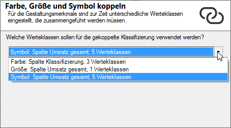
If you select this option and have previously selected different data columns for one or more design features, another dialog opens. There you will be asked which classes should be used for coupled classification?
Select one of the three available settings that were already defined for color, line width, or dashing. In the coupled relationship analysis, the system tries to combine the previously set value classes using the data column selected here. Then check the output value classes in the area display.
Select column
In the area Display a Column can now be selected, which controls the features Drawing, Color and Line width simultaneously. These are combined in a class list.
Number of classes and classification method
A classification can be used to display the lines. In the middle area, enter Classes, the Count for classes, and the method of automatic Classification or set here to User defined to edit your own classes. In addition to Analysis range, you can also specify an interval within which the values are to be taken into account. Values outside the interval always fall into the residual class "unclassified".
Edit classes
In the lower area you can define the details (class list) of the analysis. Here you can use various commands to edit Classes and various design features (dashing, color or width of the line).
- The design characteristics and class boundaries can be edited by double-clicking in the relevant cell.
For more information on editing classes, symbols, colors, and size/width, see here.
Determine the details of the analysis
You may edit further settings such as the begin and end style of the lines.
- To do so, open the Details section in the Properties. Here you may set the Begin Style and End Style of the lines. In most cases an arrow-shaped display is reasonable. A click opens a combo box with further alternatives.
In addition, you can specify whether the lines or arrows should be straight or curved from start to finish. Especially if the lines or arrows cover each other, a slightly curved representation of the lines can help.
- To do this, you can also specify a Starting Angle under Style. This determines how strongly the line or arrow is bent and how much it deviates from the direct air line. If the angle is positive (without "+"), the arrows at the starting point deviate from the air line to the right, if the angle is negative (with "-"), the arrows at the starting point deviate from the air line to the left.
| Visibility | |
| General |
Here you can control the visibility of objects and elements. |
| Scale range |
Here you can set whether the selected object or plane should be visible at each scale. Or you can specify the scale or zoom level at which the object or layer is visible. |
| In reports |
In Reports there is the possibility to change the environment only partially to zeigen. You can use this property to specify whether the layer is also visible outside the report area in this case. |
| Size adjustment |
Specify here how the size of a symbol or diagram behaves when the map scale is changed. This can change e.g. after zoom within the map, after setting a clip map or within a report, because only a part of the map is displayed. More about Size adjustment at auto zoom. |
| Alternating visibility group |
Set a group for mutual visibility here. If the element is to be made equally visible with other elements, you must use the same name for the visibility group. |
| Simultaneous visibility group |
Set a group for simultaneous visibility here. If the element is to be made mutually visible with other elements, you must use the same name for the visibility group. |
| Style | |
| Left |
Defines the representation of the beginning of the line. By selecting a suitable display, you can display an arrow. |
| End |
Defines the representation of the end of the line. By selecting a suitable display, you can display an arrow. |
| Starting Angle |
Enter an angle here if you want the line to be curved from the start point to the destination point. The value must be between -80 and +80. |
| Shadow | |
| Shadow Color |
Specifies the color in which a shadow representation of the object is to be drawn. You can specify the color using the color selection field or directly as HTML color value. If no color is specified, no shadow is displayed. |
| Shadow Spacing |
If a shadow is displayed to the object, the distance or width of this shadow can be set here. |
| Clip Map | |
| Show line if |
Set here when the line of the analysis should be drawn - if in the clip map both endpoints are visible, or if at least one endpoint is visible. |
| Common | |
| Comment | Enter here a comment for the display of the workbook in EasyMap Xplorer. The comment is also displayed in EasyMap as a tooltip in the control window Contents. |
Section Labeling
In the area line labeling the lines and arrows can be labelled data-dependently. For this purpose, e.g. start location, destination or values can be used. Only the columns of the data table used as the data basis for the analysis can be used for labeling.
In addition, you may also enter a standard text for all lines in the User-Defined Labeling box.
Note: How to insert symbol texts and how to influence the display of the texts can be found here.
Create tooltips for analysis
When crossing the lines on the map, you can display user-defined information about them.
Note: You can find out how to implement tooltips here.
