
Supply Level
The Analysis Power Supply in the menu area organisation shows the degree of coverage of an area by the existing locations. you visualizes the ranges of the locations. The capacity of the locations as well as the distribution of the data over the area. The analysis shows which areas of more than one location (= oversupply) and which areas are not served by any location. (= undersupply).
As a basis for calculating the coverage rate you can also select the distance to location instead of a data column. With this you have e.g. quickly answers the question:
Which areas are located within a 100 km radius of at least one Location?
Example
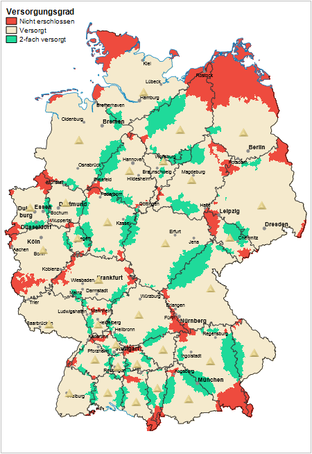
The figure below shows in red areas that are not sufficiently supplied by the existing locations, while in turquoise oversupplied areas are shown. The presentation is based on the assumption that each site aims to exploit the potential in the surrounding area and extends its catchment area until the capacity limit of the site is reached. Naturally, they remain unsupplied far from the site, unless they are reached from another site. Where locations are too close to each other, there are areas that can be well supplied from several locations. Such a supply level analysis provides information on how well or how badly the locations are distributed over the area.
Creating the Analysis Supply Level
You can access the analysis via the menu Territory organization > Analyses > Performance level. First, you are asked at which level or at which locations the service areas are to be calculated.
Alternatively, in the control window Territory organization you can also insert the analysis coverage level in the context menu of the area or site level under analyses.
Selection of the data basis
In the next step, select the Map in which the analysis is to be displayed and the Layer on the basis of which the coverage level is calculated. The basic building block level and all subordinate area levels of the territory structure can be selected as levels.
Then click on Complete and EasyMap will insert a first draft of the distance zones into the map.
Select data input and connect the data to the map
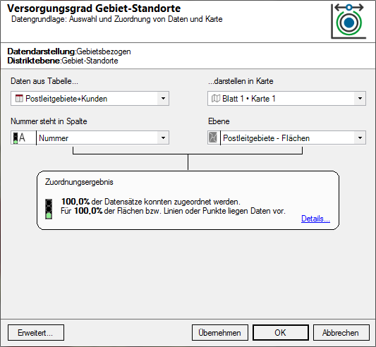
- First select the table that contains the data to be displayed in the analysis. Only query tables from the subordinate brick levels are available for selection as data tables. For information on how to attach data to the brick levels, see here.
- In addition, you specify on which sheet and in which map the analysis is to be displayed.
- Then check whether the column with the area number (e.g. postal code) from the table of the corresponding levels (e.g. postal code areas - areas) corresponds to the base map. The area number is used to assign the individual data records to the corresponding area.
- What does assignment result?
- Would you like to place your data on the map using geographical coordinates? So the Place data using geographic coordinates.
- Via the Advanced button you can specify whether the analysis should consider an existing clip maps in the calculation of classifications - more about Analysis reference.
Edit Properties
Immediately after inserting the analysis, the Properties on the right side of the program window open (default setting). The properties can be reopened at any time via the control window Content by double-clicking on the map layer Power consumption.
Calculation of the supply rate
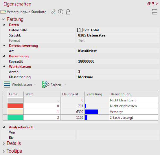
In this analysis, similar to the analysis surface coloration, the data column to be analyzed can be selected. The default is the column Area. Under Statistics you will find various codes for the selected column.
Important for this analysis is the setting of the capacity of a location. The value indicates how many areas in the vicinity of a location are considered to be supplied. Starting from the location and sorted by distance, all areas are collected until the cumulated total exceeds the capacity of the location. If "(distance to location)" is selected as the data column, the capacity is understood as a distance value that must not be exceeded. Depending on the data column selected, the capacity value in the Calculation range must be adjusted (see figure on the right).
class formation
The areas of the brick level of the selected level can be colored here classified, by forming classes. The creation of classes offers you numerous setting options. In addition to the number of classes or move-in areas, you can also define how the limit values of the classes are to be determined.
In the middle area, enter Classes, the Count for classes, and the method of automatic Classification or set here to User defined to edit your own classes. In addition to Analysis range, you can also specify an interval within which the values are to be taken into account. Values outside the interval always fall into the residual class "unclassified".
- In the area of Class list you can specify details of the analysis. Here you can use various commands to edit Classes and Color.
- The design characteristics and class boundaries can be edited by double-clicking in the relevant cell. For example, you can select the color individually by double-clicking on the color for the respective class.
- For more information on editing classes, symbols, colors, and sizes, see here.
Note: By sorting according to the name of the class, you can force a certain order in the legend!
