
Report
In this workbook all four report types from EasyMap are presented to you. Reporting is about the serial production of maps that may differ in size or in the analyses presented. If you want to learn more about the different report types, please watch our video Reporting.
The workbook contains the following sheets:
- area report - the map is divided into subareas disjointed
- Filter report - Analyses are changed by data filter
- Column report - Analyses alternate by different columns
- Nested report - Combination of two reports
Report on regions
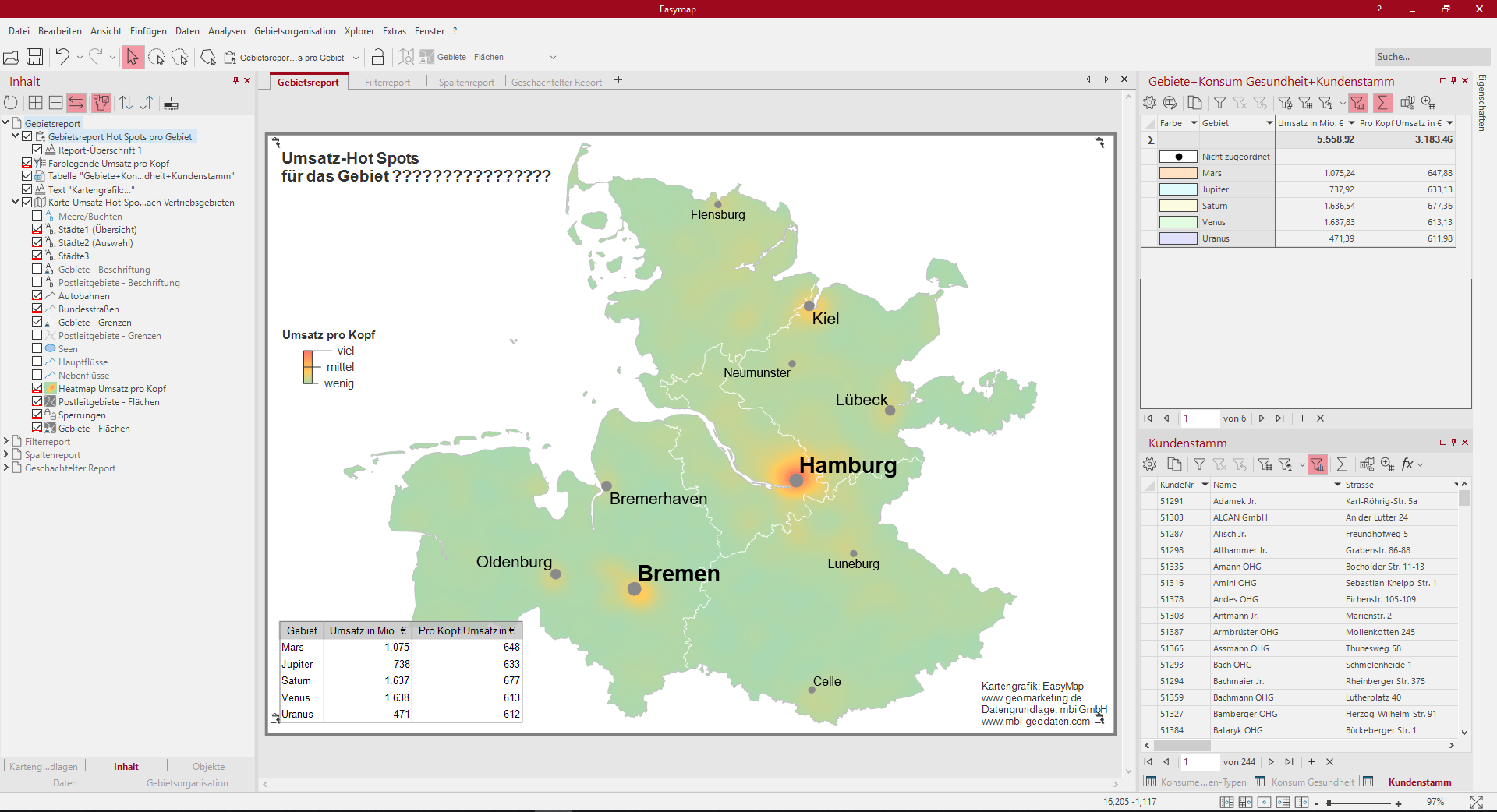
The area report automatically creates maps of the selected subareas. These can be, for example, the territories of the territorial structure or the individual federal states. In our example it is an area report on the level areas - areas and generates individual maps of our sales representatives. Each of these maps shows a Heatmap of sales per capita and the distribution of sales hotspots within an area. In addition, there is a table object next to the map that displays the turnover in million € and per capita. The table is reduced according to the area displayed in the report.
Try the area report by right-clicking on the Area Report Hot Spot per Area layer in the control window Content and selecting the context menu command Show Report Preview.
So you can recreate this map:
- Create a territory structure with the help of the Assistant Create new territory structure..., then aggregate the table "Customer master" to the territory work table via the button Edit query.
- Insert analysis Heatmap: Table "Consumption Health", select the extended setting Only use the data visible in the clip map, change the data column in the Properties to "Per capita turnover in €", calculate within a radius of 10 km and change the colours to a different colour gradient.
- Color Legend for the Labelling in the Properties area, select the Custom labels option to describe the color gradient of the legend with individual texts.
- table object for the Territory Work Table "Territories + Consumption Health + Customer Base" on the sheet, design it appealing in the Properties and in the Content area keep the Filter according to clip map.
- Report with the report type Insert Area Report.
- Report heading 1 edit the Properties for the ReportHeader with a fixed term and leave only the macro {Report.CurrentName}.
The following tables were used:
- regular clientele
- Consumption Health
- Territories+Consumption Health+Customer base
Report on filters

The Filterreport is based on a symbol analysis of the customer locations. One after the other, maps are created according to the ABC customer classification. In addition, customers are shown in different sizes depending on their sales category. For the ABC customer classification a colour legend and the turnover according to size classes a size legend was added. Instead of the topographic levels, this sheet contains the Internet map . When zooming in, this offers more depth of detail than the topographic layers. The individual chart shows the distribution by industry for each ABC classification.
Try the filter report by right-clicking on the Customer Classification Filter Report layer in the Contents control window and selecting Show Report Preview from the context menu.
So you can recreate this map:
- Insert the analysis Symbols: Table "Customer Master", with the settings at Symbol and Color vary over the column "Classification" with classes after Feature, Size over the column "Total Sales".
- Color Legend for the color classification of the symbols.
- Size Legend for the sales classification.
- Stand-alone Chart for the distribution by industries from the "Customer Master" table with the diagram type Circle Sector Diagram, select the label(s) in the Details for Data Labeling for Contents.
- Report with the report type Filter report on the data column "Classification" and an auto filter by characteristic (values A, B, and C customers).
- Complete the Report heading 1 with your own text.
The following tables were used:
- regular clientele
Report on columns
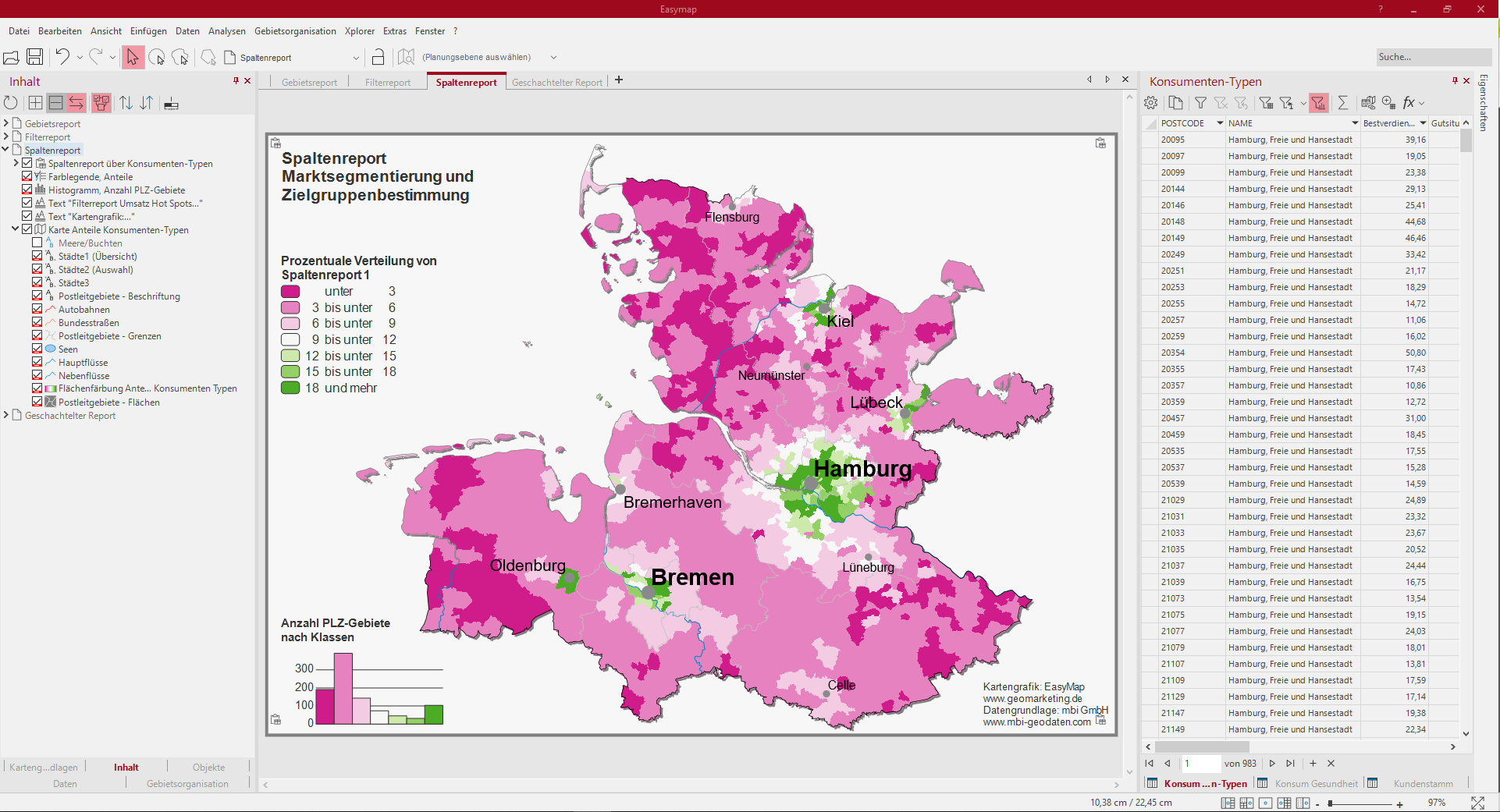
The column report alternates between different consumer types and shows the percentage distribution in the postal codes with the help of an area coloring. There is a colour legend and a histogram for the surface colouring with the frequency distribution in the individual classes. The Color legend is only marked with the corresponding name for the displayed column during Produce report. The Histogram shows you very nicely the different distribution of the individual consumer types on the classes of surface coloration.
Try the column report by right-clicking on the Column report on consumer types layer in the control window contents and selecting the context menu command Display report preview.
So you can recreate this map:
- Area Coloring for the Consumer Types tables, select a column of consumer types, set a Custom Classification for seven classes, and select a Color Gradient for three colors.
- Color Legend for analysis insert surface coloring and adjust content of heading - keep text macro, alignment left-justified.
- Histogram and adjust the labeling interval to the value 100.
- Report with the report type Insert Column Report and select the columns to be displayed on the individual report pages, as well as select the area color to change the analysis for the report.
- Report heading 1 with fixed texts, so that this can also function as a page heading.
The following tables were used:
- consumer types
Nested report
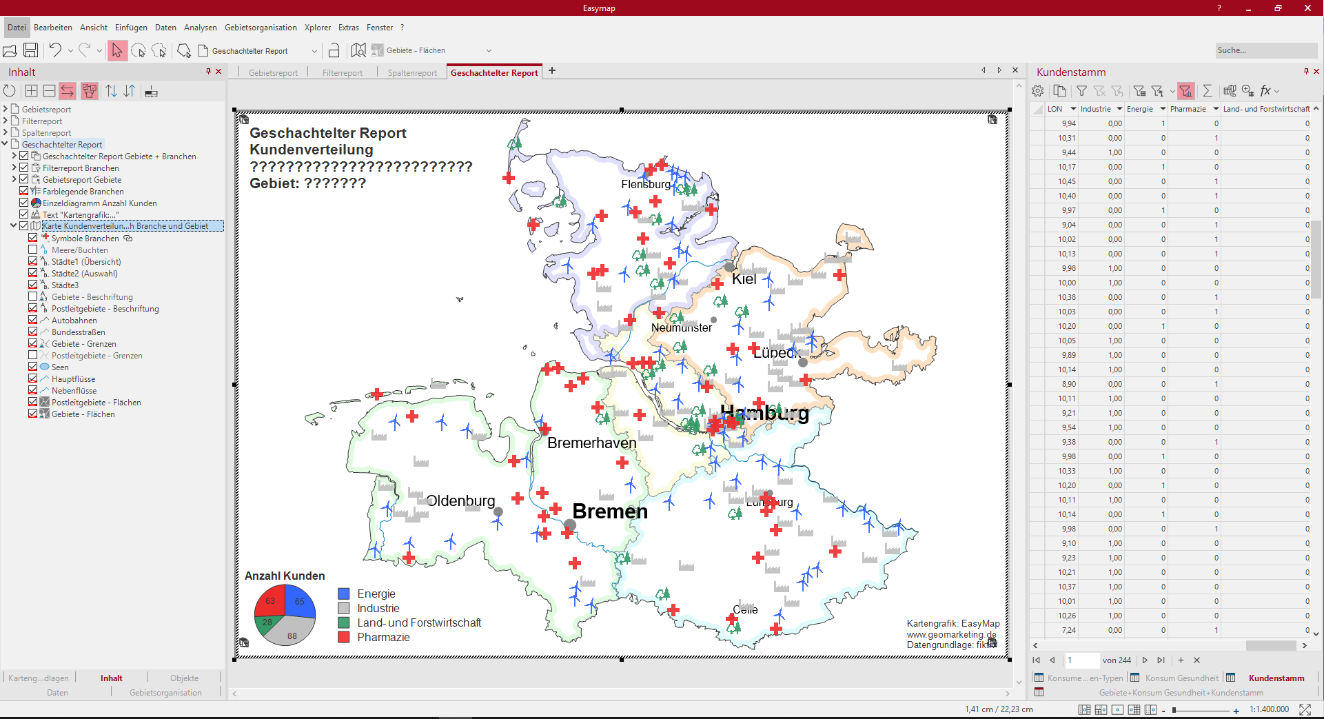
In this example, the Nested Report shows the interaction between a Area Report of the field service areas and a Filter Report about industries. On the map there is a territorial structure, which is represented by an edge coloring. Symbol analysis represents customers according to different industries and is used for the filter report. The color legend provides information about the industries on the map and also serves as an explanation for the distribution of the individual diagram Number of customers. Individual maps per area and industry are generated.
Try the Nested Report by right-clicking the Nested Report Areas + Industries layer in the control window Content and selecting the View Report Preview context menu command.
So you can recreate this map:
- territory structure from the control window Territory organization with the layer "Territories" add to the map by drag&drop.
- The layer "Areas - Surfaces" in the Properties area Display is provided with a Edge color.
- Insert a Area report for the layer "Areas - Surfaces".
- Insert an analysis Symbols: Table "Customer base", analysis first couple, select column "Industry" and classify by Feature, select different symbols.
- Insert a single diagram for the individual branches of the Territory Work Table "Territories+Consumption Health+Customer Base".
- Color Legend which will explain both the symbol analysis and the single diagram.
- Report on filters insert: Select the "Customer Master" table with the "Industry" column.
- Report with the report type Insert nested report, here the area report is selected as higher-level report and the filter report as lower-level report.
- As ReportHeader only the header of the nested report is made visible.
The following tables were used:
- regular clientele
- Territories+Consumption Health+Customer base
