Color Legend
A Color Legend describes the colors used to display areas, charts and symbols; it illustrates the significance of colors by documenting the connection between data values and their color representation. The colors used in an analysis can be described by the corresponding value classes, texts or both. The number of areas per value class may also be included.
Like all other legend elements, you can insert the color legend on the relevant sheet either via the navigation window Objects or via the Insert Legend Elements menu.
The appearance of the legend can vary greatly depending on the classification of the underlying analysis. Analyses with continuous color gradients have, in contrast to color classes, a color gradient bar.
Editing the Properties of the Color Legend
The properties of the legend can be accessed via the context menu of the legend in the control window Content or directly via the legend in the map. There you can, for example, change the wording of the heading or make further settings for the font and display.
Customize the content
The setting options vary depending on the analysis selected. Edit the content in the section Content of the legend Properties.
Section Content - For legends that display analyses with value classes
The following properties are available for analyses that use value classes:
| Optional columns | |
| Class Range Limits |
If Display is selected, the class limits (from ... and to below...) set in the analysis are displayed in the legend. |
| Class Label |
If Display is selected, the class designations used in the analysis are added to the legend. |
| Area Count | If the selection is set to Display, the number of areas, symbols or diagrams that are in the respective class according to the analysis is entered after each class. |
| Class sums |
Displays the values of the totals column from the analyses - as Sum of absolute values, as Percentage share or both values. |
| Class selection | |
| Used Classes Only |
With Only occupied classes you get a list in the legend of classes (colors, values and symbols) that actually occur in the map. |
| Show "not classified" |
Each classification also contains a residual value class in which those values are sorted that do not belong to any other class. You use this option to specify how this residual value class is to be displayed. The unclassified cases can be displayed in the legend as first class, last class, or not at all. The options "as first class" and "as last class" are associated with Sort order (tab Settings). If the unclassified cases are displayed as the first class in ascending sort order, they appear in the legend above. If the unclassified cases are displayed as the first class in descending sort order, they appear in the legend below. If the unclassified cases are displayed as the last class in ascending sort order, they appear in the legend below. If the unclassified cases are displayed as the last class in descending sort order, they appear in the legend above. Note: This setting has no effect if the associated display characteristic is not data-controlled. |
| Caption of class ranges | |
| Open Downwards |
Description text for the class boundaries (value is below) - standard text:below |
| Separating Text |
Description text for the class boundaries (values between the start and end values of a class) - standard text:up to |
| Open Upwards |
Description text for the class boundaries (value is above) - standard text:and more |
| Style | |
| Use analysis style |
Many analyses consist of several representation characteristics, e.g. color, size and symbol form. With the exception of the combined legend, only one of these display characteristics is ever displayed in the analysis. This property determines how the other display characteristics are to be displayed. No: For the other display characteristics, the settings of the legend are always used (shape of the color areas for size and color legends, symbol filling for size and symbol legends). Yes, if uniform: If a uniform presentation is used for the other presentation features, this presentation is used. The legend setting is ignored in this case. If the display is not uniform or does not become uniform due to any changes, the settings of the legend are used. |
| Color-Box Shape | Select the shape (e. g. Rectangle, Circle or Square) of the colored areas. |
Contents area - for legends that display continuous gradient analyses
If the colors are calculated in proportion to the data values, the following properties are available in the Content section:
| Sample Values | |
| Select |
Automatic: EasyMap dynamically selects 3 example values based on the data situation User-Defined: You specify 3 values for which an example diagram is to be drawn in the legend. |
| Calculation |
(only with selection=Automatic) Minimum, Average, Maximum: As example values, EasyMap selects the smallest, average and largest values that still lead to a visible diagram. Equidistant (0...Maximum): The largest occurring value and 1/3 and 2/3 of this value are used as example values. |
| Smoothing |
(only with selection=Automatic) No: The calculated example values are used as exactly calculated values. Yes: The calculated example values are rounded to smooth values. |
| Caption of value 1, value 2, value 3 |
(only with selection=User defined) Here you define the 3 values for which an example diagram is to be drawn. |
| Labeling |
Values: EasyMap takes the values defined in the sample values selection. User-Defined Labeling: You can also assign labels that deviate from the values - e.g. little, medium, much. |
| Caption of value 1 (analog values 2 and 3) |
Enter the labels for the three values here. |
Change other properties
You can change properties such as the wording of the heading, font settings or the display of the legend object in the two sections Common and Settings.
Select the section whose settings you want to see in detail:
Section Common
|
Caption and Editability |
|
| Caption |
Specify a name here to be able to find the element more quickly in the Contents control window. For analyses, maps or sheets, you should use a name that contains the topic. EasyMap assigns generic names for new elements (e.g. map 1). If you do not change these, you will later have great difficulty in finding certain content in workbookn. |
| Comment |
Enter here a comment for the display of the workbook in EasyMap Xplorer. The comment is also displayed in EasyMap as a tooltip in the control window Contents. |
| Visibility | |
| General |
Here you can control the visibility of objects and elements. |
| Alternating visibility group |
Set a group for mutual visibility here. If the element is to be made equally visible with other elements, you must use the same name for the visibility group. |
| Simultaneous visibility group |
Set a group for simultaneous visibility here. If the element is to be made mutually visible with other elements, you must use the same name for the visibility group. |
| Reference | |
| Analysis | Name of the analysis this legend refers to. |
| Location | |
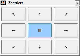
| Anchor point |
Select the point from which the size of the element is to be calculated.
|
| Offset Left |
In conjunction with the reference point, the distance in cm from the left. |
| Offset from Top |
In conjunction with the reference point, the distance in cm from the top. |
| Size | |
| Width |
Width of the object in cm. |
| Height |
Height of the object in cm. |
 Section Settings
| Header | |
| Content |
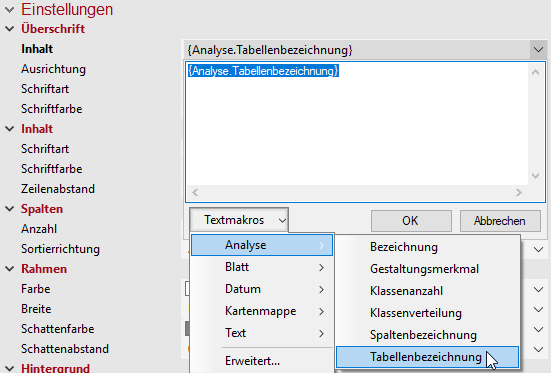
Heading of the legend, table or single diagram or of the text to be displayed in the map. As a rule, the text is output via a text macro (you can recognize text macros by their curly brackets). For analyses, the wording of the legend consists of the name of the column used for the analysis. You can use additional text macros for the heading. For example, you can use a text macro to force the system to display the name of the analysis or the names of the table used. To do this, expand the text box next to the Header setting and click Text Macros > Analyse, then select Name or Table Name.
More information on the individual expression categories of text macros can be found here. |
| Alignment |
Here you can set how the text is aligned (within the legend or table). |
| Font |
Defines the font of the heading. |
| Font Color |
Specifies the font color of the heading. You can specify the color using the color selection field or directly as an HTML color value. |
| Content | |
| Font |
Defines the font of the content. |
| Font Color |
Specifies the font color of the content. You can specify the color using the color selection field or directly as an HTML color value. |
| Line Spacing |
To make the legend easier to read, you can increase the line spacing between the individual elements. |
| Data | |
| Sorting Order |
Sorting Direction of the columns - ascending or descending. |
| Border | |
| Color |
Specifies the color in which the frame around an object is to be drawn. You can specify the color using the color selection field or directly as HTML color value. If no color is specified, no frame is displayed. |
| Width |
If a frame is displayed around the object, the width of this frame can be set here. |
| Shadow Color |
Specifies the color in which a shadow representation of the object is to be drawn. You can specify the color using the color selection field or directly as HTML color value. If no color is specified, no shadow is displayed. |
| Shadow Spacing |
If a shadow is displayed to the object, the distance or width of this shadow can be set here. |
| Background | |
| Fill |
Define the background of your element here. You can specify the color or the fill effect using the Color Selection Box or directly as HTML color value. |