
Label
Similar to Symbol analyses , the Labels analysis tool facilitates not only the exact positioning of labels on your map, but also the visualization of other attributes through data-driven coloring and sizing of the labels.
You access the analysis Label from the menu Analyze.
Note: Apart from setting display properties for labels, it is imperative that you specify the text to be displayed. Switch to the Labeling section to do this.
Selection of the analysis type and the data basis
The Analysis Type lets you choose whether your Text will be displayed as area () or location () based analysis.
How to link data with the map is explained here.
- What does assignment result?
- Would you like to place your data on the map using geographical coordinates? So the Place data using geographic coordinates.
- Via the Advanced button you can specify whether the analysis should consider an existing clip maps in the calculation of classifications - more about Analysis reference.
After the selection of the analysis type and the data basis the texts are inserted directly into the map after clicking on Ok.
Set Properties of the Analysis
Properties refers to all settings for calculating and displaying the analysis. You can select certain columns of the previously defined table to control certain aspects of the display (for example, the color). You also reach this settings dialog if you want to edit existing analyses.
With this analysis subtype Font, Color, and Font Size can be controlled by different data columns. This means that there is a section for each property, in which the column to be controlled for this property can be selected.
Note: Of course, it is not only necessary to specify how the text is to be displayed, but above all which text is to be displayed. This is done in the section Labeling
Control font, color and font size from different data columns
First select Font, Color or Font size a Data column in the different areas.
- With a area-related analysis you can additionally determine aggregation of the data of the selected column. This specifies the rule how data are combined if several data are available for an area.
-
The Format option is only available for area-specific analyses. Normally, the formatting of the selected data column is also used for the analysis result; this is always the case for site-specific analyses. For certain aggregation procedures (for example, number of values), however, this formatting cannot be used meaningfully. You can define a new formatting here, which is used in legends for this analysis, for example.
- Under Statistics you can display statistical information (e.g. number of data records, min., max.) for the selected column - click on the button in the field next to Statistics.
Settings for changing:
Font
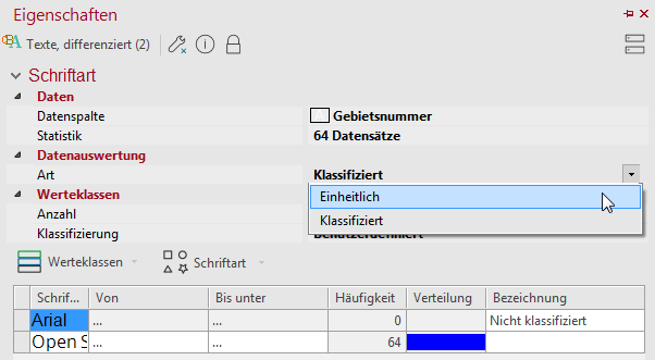
The font of the label can either be uniform (not data-driven) or be classified by means of a data column.
- : Specify the number of value classes and the classification method to differentiate the font according to the selected column.
- By double-clicking on a cell in the Font column, you can change the font.
- For more information on value class creation, see here.
Color
The color of the labels can be varied here either uniform (not data controlled), classified, continuous or via a preset color value.
- Classified: You can use classes to specify a schema that determines how these are to be displayed for a range of values. When the analysis is presented, the class in which the value falls is then checked and the presentation of the design characteristic concerned is determined from this.
- For more information on creating value classes, see here.
- Continuous: This option colors the symbols without specifying value classes in a continuous color gradient depending on the selected column. The symbols can only be colored continuously for number columns. As with the classified option, you can restrict the analysis area, define a gradient or set the color outside the analysis area.
- Preset: With the option Preset a color value in HTML color definition (e. g. #00FF00) can be retrieved directly from the data.
Font Size
The font size can be set either uniform (data independent) or depending on a data value classified or proportional.
- Classified: You can use classes to specify a schema that determines how these are to be displayed for a range of values. When the analysis is presented, the class in which the value falls is then checked and the presentation of the design characteristic concerned is determined from this.
- For more information on creating value classes, see here.
- Proportional: The classification type proportional allows you to calculate continuous font sizes that are calculated using a factor derived from the analyzed data value. The data value defines...
- ...height/width: The font size is linearly determined by the data value, i. e. the texts differ greatly in size. More information.
- ...Surface Area: The font size is linearly determined by the data value, i. e. the texts differ less in size. More information.
- Size/Width: Here you can enter the preferred sizes for the labels. Among other things, you can directly specify the factor that is used to calculate the size out of the data value.
- Dynamic sizing:
- Preserve ratio: This setting maintains the value entered in the 1.00 cm equivalent to field.
- Preserve max. symbol size: This setting maintains the value entered in the Maximum field.
Let the properties of the texts be controlled only by one data column
If you want the font, color and font size properties of the texts to be controlled by one and the same column, you must first link the analysis. The function Color, font size and font pair can be found either in the Properties of the analysis (at the bottom of the Properties window) or in the context menu for analysis in the control window Content. Then the structure of the Properties window changes.
Data columns have already been determined for a design characteristic:
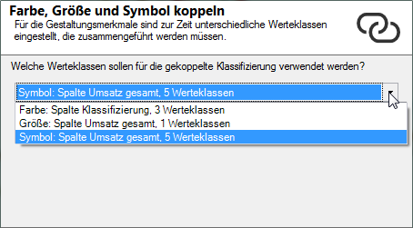
If you select this option and have previously selected different data columns for one or more design features, another dialog opens. There you will be asked which classes should be used for coupled classification?
Select one of the three settings offered here that were already defined for color, size, or symbol. In the linked symbol analysis, the system tries to combine the value classes set so far using the data column selected here. Then check the output value classes in the area Display.
Select column
In the Display area you can now select a Data column that controls the characteristics Font, Color and Font size simultaneously. These are combined in a value class list.
Properties for area-based analyses:
- With a area-related analysis you can additionally determine aggregation of the data of the selected column. This specifies the rule how data are combined if several data are available for an area.
-
The Format option is only available for area-specific analyses. Normally, the formatting of the selected data column is also used for the analysis result; this is always the case for site-specific analyses. For certain aggregation procedures (for example, number of values), however, this formatting cannot be used meaningfully. You can define a new formatting here, which is used in legends for this analysis, for example.
- Under Statistics you can display statistical information (e.g. number of data records, min., max.) for the selected column - click on the button in the field next to Statistics.
Number of classes and classification method
In the middle area, enter Classes, the Count for classes, and the method of automatic Classification or set here to User defined to edit your own classes. In addition to Analysis range, you can also specify an interval within which the values are to be taken into account. Values outside the interval always fall into the residual class "unclassified".
Editing Classes
In the lower area you can determine the details (value class list) of the analysis. Here you can use various commands to edit value classes and various design features (color, font, size).
- The design characteristics and class boundaries can be edited by double-clicking in the relevant cell.
- for more information on editing value classes, symbols, colors and sizes, see here.
Determine the details of the analysis
In Details you define other (non-data-dependent) properties of the analysis.
The following properties are available:
| Visibility | |
| General |
Here you can control the visibility of objects and elements. Choose between never visible, always visible or scale dependent visible here. The last option provides the settings for Automatic Zoom. |
| Scale range |
Here you can set whether the selected object or plane should be visible at each scale. Or you can specify the scale or zoom level at which the object or layer is visible. |
| In reports |
In Reports there is the possibility to change the environment only partially to zeigen. You can use this property to specify whether the layer is also visible outside the report area in this case. |
| Size adjustment |
Specify here how the size of a symbol or diagram behaves when the map scale is changed. This can change e.g. after zoom within the map, after setting a clip map or within a report, because only a part of the map is displayed. More about Size adjustment at auto zoom. |
| Alternating visibility group |
Set a group for mutual visibility here. If the element is to be made equally visible with other elements, you must use the same name for the visibility group. |
| Simultaneous visibility group |
Set a group for simultaneous visibility here. If the element is to be made mutually visible with other elements, you must use the same name for the visibility group. |
| Show original position | |
| Style, Line Width, Line Color, Start, End |
Here you can set how the arrows between text and position point are to be displayed. You can specify the start and end points of the lines, the line width/color, and the style. Applications and other settings for the original position indicator can be found here. |
| Effect | |
| Type |
No Effect: The text is displayed normally. Shadow: The text is displayed with a drop shadow. Outline: A wider border ("contour") is drawn around the edges of the letters. |
| Color and Width |
If you select Art a Shadow or a Contour you can select the Color via a color selection field and specify the width of the design element in point size. |
| Text box | |
| Fill |
Define the background of your element here. You can specify the color or the fill effect via the color selection field or directly as HTML color value. |
| Border Color |
Specifies the color in which the frame around an object is to be drawn. You can specify the color using the color selection field or directly as HTML color value. If no color is specified, no frame is displayed. |
| Common | |
| Comment | Enter here a comment for the display of the workbook in EasyMap Xplorer. The comment is also displayed in EasyMap as a tooltip in the control window Contents. |
Determine the displayed text of the analysis
Of course, it is not only necessary to specify how the text is to be displayed, but above all which text is to be displayed. The settings for this can be defined in the section Label.
EasyMap always offers the data from the table that you selected in the step Data Input for labeling. In the case of an area based representation, the Geographical data is also available for labeling (e. g. Default labeling of the areas). No geographic data is available for a location based analysis.
For more information on custom labeling, see here.
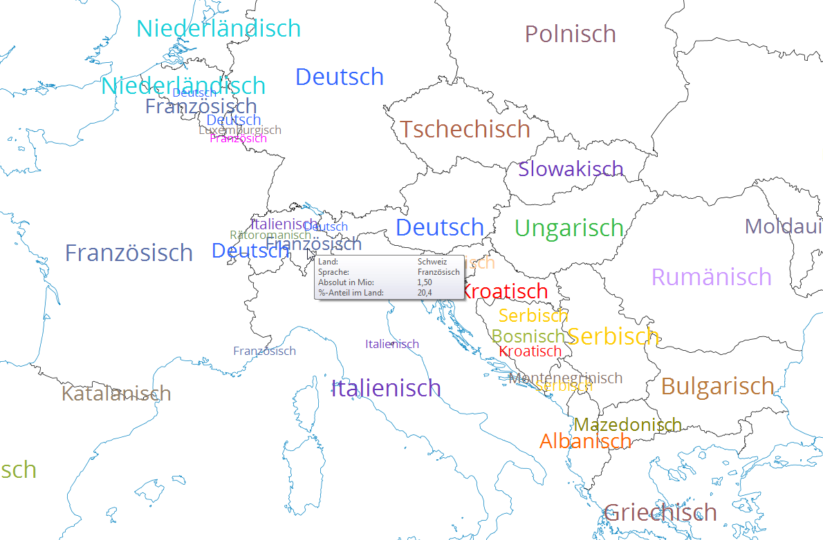
Create tooltips for analysis
When you hover over the texts in the map, you can display further user-defined information about them. This information can be shown in addition to the text displayed on the map.
Note: You can find out how to implement tooltips here.
